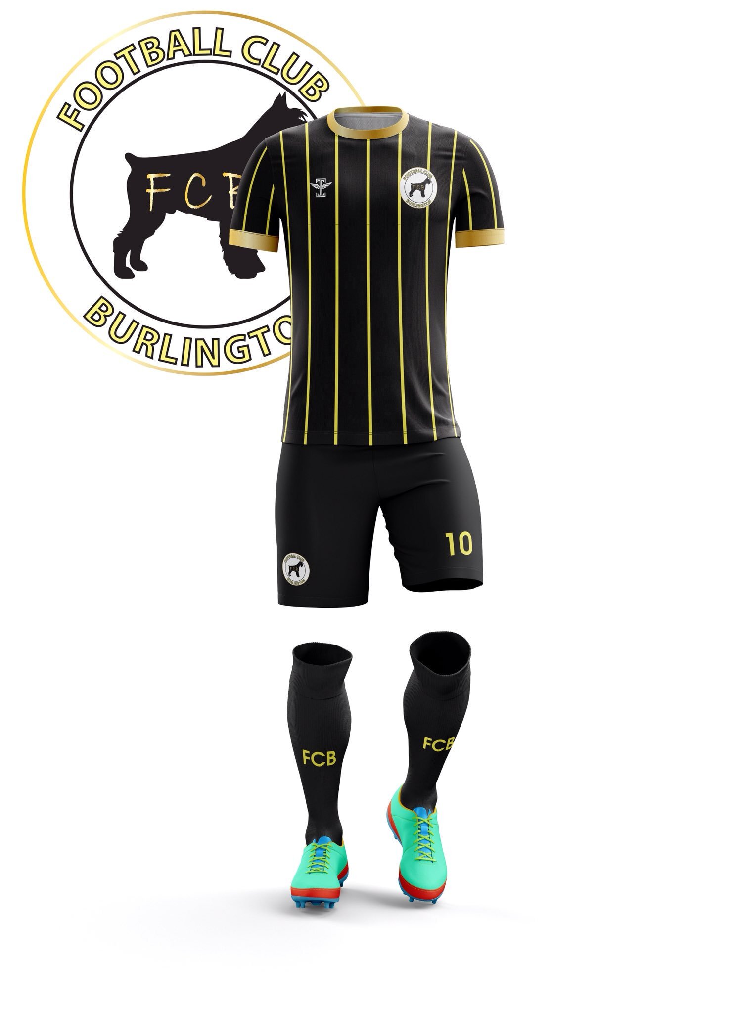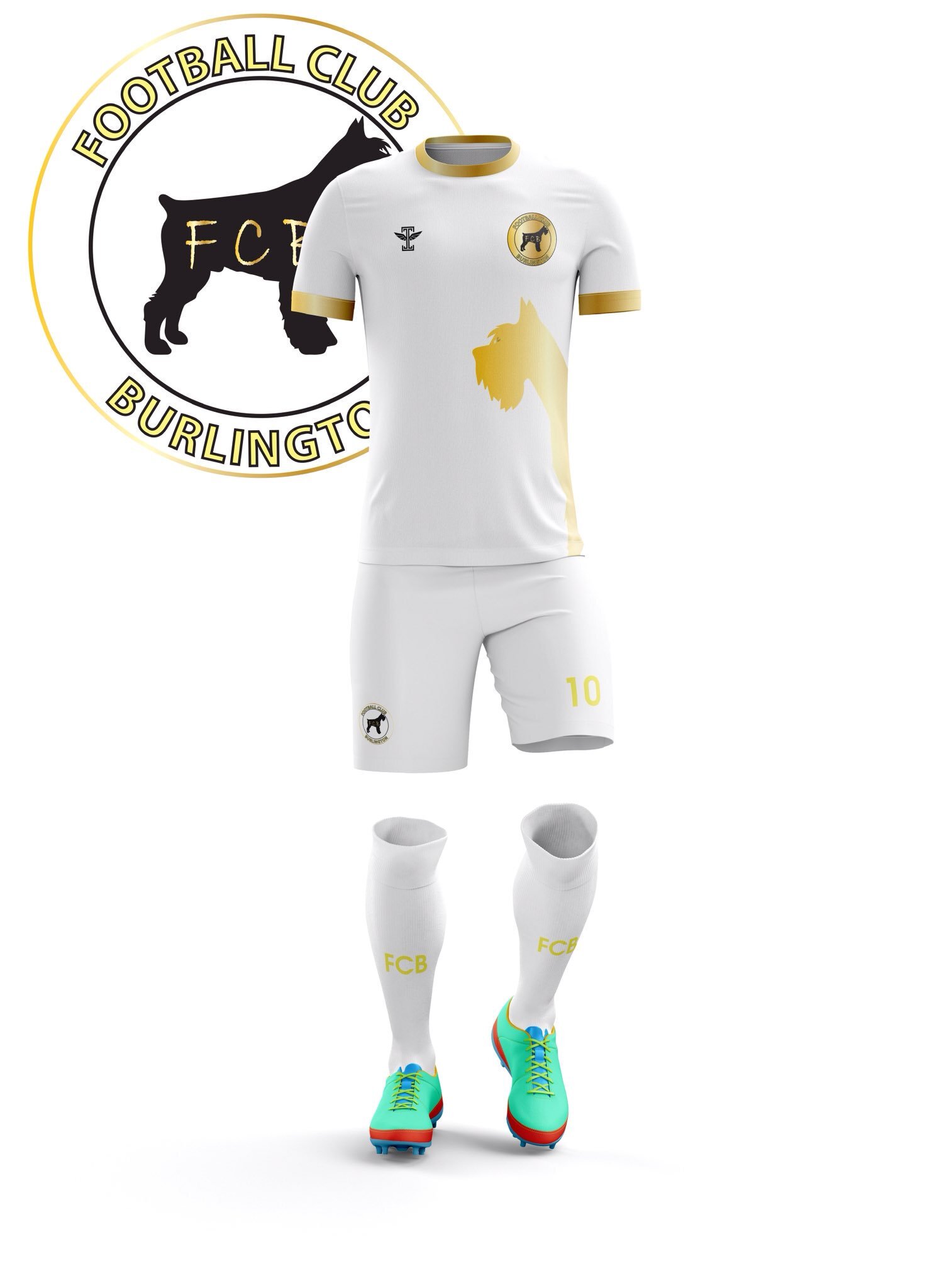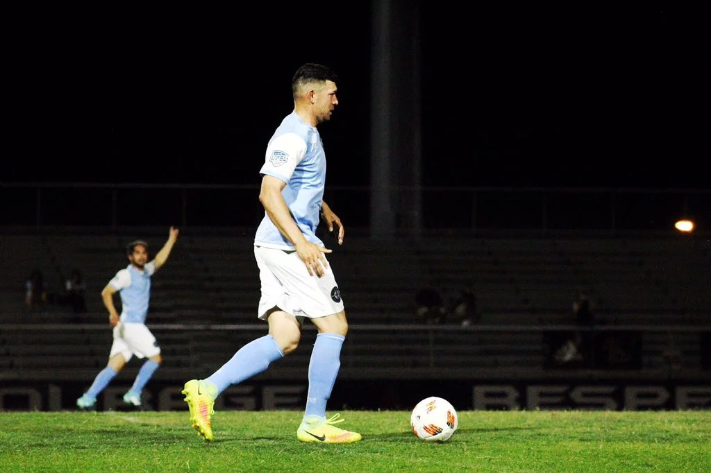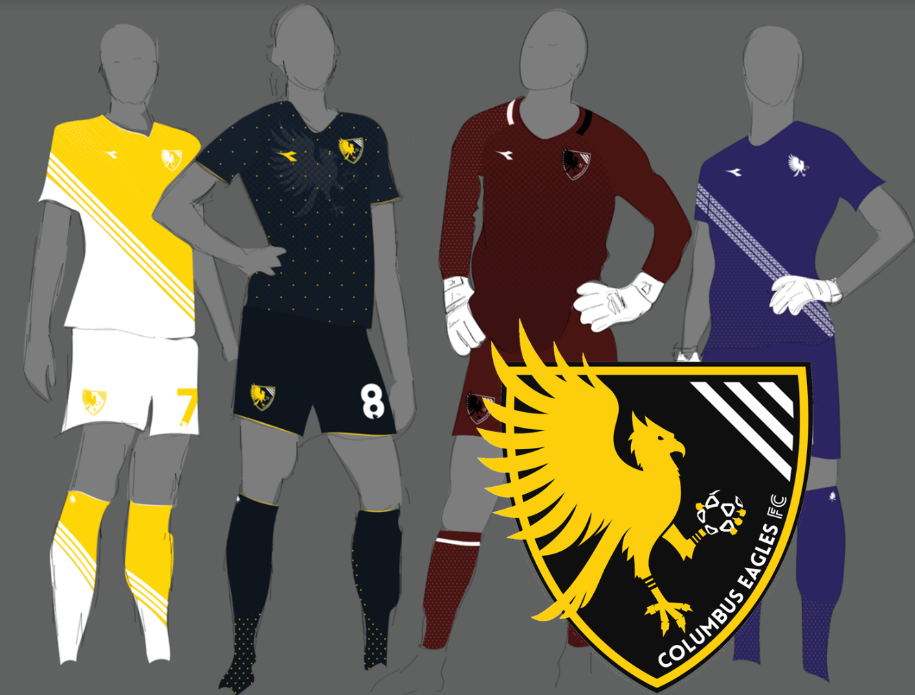
Columbus Eagles: Player-Designed
Soccer shirts are a really unique confluence where design and function collide – sometimes its catastrophic and sometimes, in this case, the results are downright soccer-couture. Columbus Eagles are a WPSL side, founded in 2014, who came out of the gates wearing Adidas and showing a fun eagle logo which, nobody would bat an eye at. Who knew that just four years later it would be redesigned, and that it would come out even better! Columbus rocked brand new kits in 2019 as well, and we wanted to get the lowdown on their design and the motivation behind the soaring rebrand. Mark Wise, Owner & CEO, was happy to answer a few questions and he was kind enough to put us in touch with graphic designer Larissa Najjar, as well as Chief Operating Officer Grant Burkhardt – I hope you love good content, because this episode of Uniformity is chock-full.
Your new club crest designed by Larrissa Najjar is strong and simple - what inspired the rebrand and how important is it to you to give your players non-soccer professional experience, whenever possible?
The rebrand was entirely Larissa and Grant Burkhardt's idea. Larissa being a graphic artist and Grant is my brand manager (among many other roles). They wanted something that was fresh and in line with our target audience. We love to bring our players into the back office whenever they want to. They come from various business fields and their experience along with their soccer IQ is great for any club.
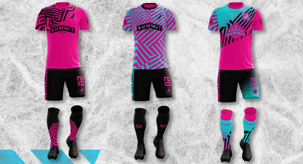
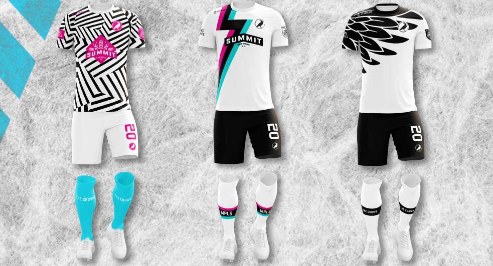
Not only has Najjar nailed the new crest, but she was also tasked with custom designing your 2019 kits - what led the club to pursuing a custom kit and how popular has it been? Have there been enough sales to help with operational costs?
Again, Larissa and Grant proposed the custom kits. I think the idea was if we want to grow into a professional club, we need to look and act like a professional club. The custom kits were an instant hit. Many positive comments and a large increase of sales over the previous year of jerseys. The volume is still not enough to help offset operational costs, but we will see how that goes this year.
In the US, there are a handful of apparel providers who work with grassroots clubs, but I've never seen anybody work with Diadora. Why them? Would you recommend them to other clubs?
Diadora was (they have been replaced this year with Erris) our uniform and equipment supplier for a couple of years. They gave us a good discount and a link from their web-page. When we wanted to do a custom jersey, they quoted a price that we could not afford. So, we went with another label for the custom jerseys. We kept our Diadora sponsorship by adding the Diadora logo on the jersey tops, but the design was all ours and the production was sub-contracted.

Some clubs offer new kits every year, some go every-other year; how long will these beauties grace the pitch and are there already new designs in the pipeline?
Right now we have plans to re-use the design for 2020. After that, who knows? Custom designs are much more difficult to deal with, but very much appreciated. We will have to see how much our fan-base grows in the next year.
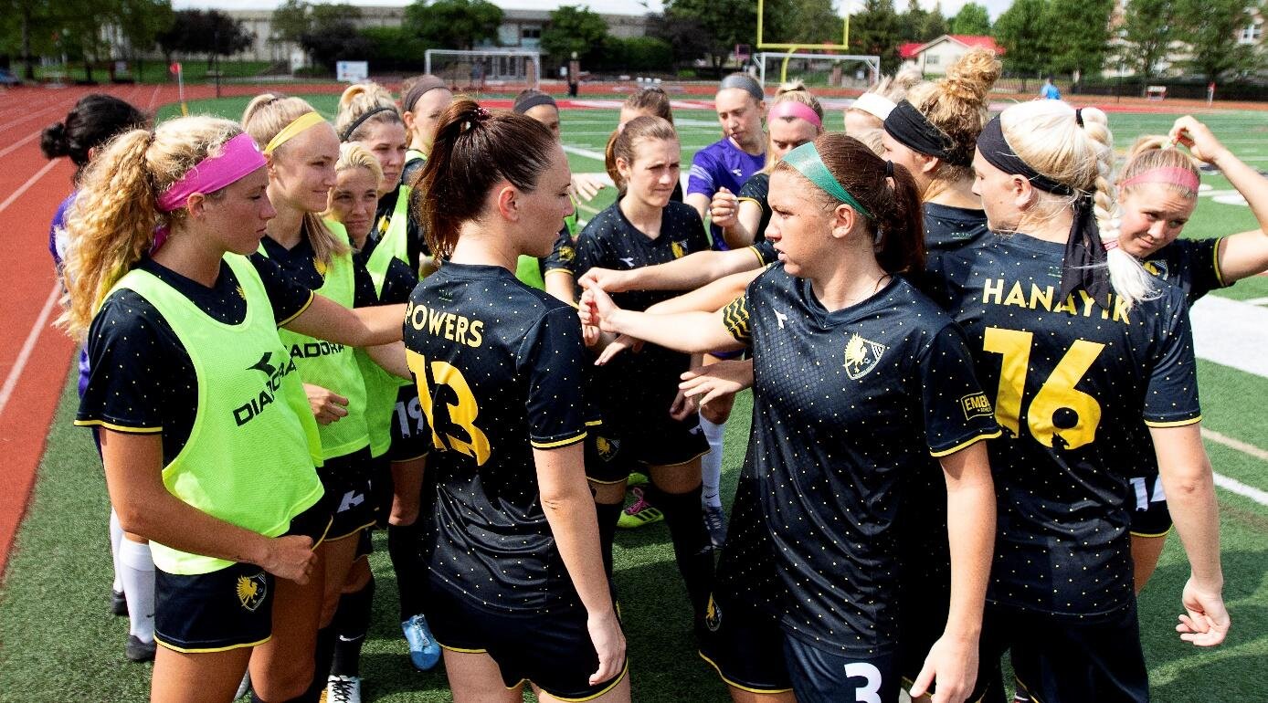
Thanks for making a men's cut of this gem, I bought one! But what made you think to do so? Was there already a demand and has it sold well enough that you'll continue to have quantities available to “kitnerds” like myself?
The kits were designed to be comfortable for our players (after all they were designed by a player). However, you don't want to limit your potential customer base to just women, right? I think there should always be both options.

Do you feel any effects of marketing apparel and merchandise in an MLS market? Have you carved out your niche? Or are Columbus soccer fans generally supportive of both clubs and maybe it's actually beneficial? What do we have to look forward to in 2020?
I think Columbus soccer fans support soccer in general. We are much too small a footprint to be any competition to the MLS market. We definitely are working on a membership campaign for 2020. I want to double our average attendance from last year (paid seats, not free tickets). Kit's will have slight alterations to the design. Custom kits will need to be pre-ordered this year so expect that push early in 2020. Other than that, you will have to wait and see! Creative ideas are always flowing here!

Former player, Larrissa Najjar, professionally a graphic designer, not only redesigned the club’s crest, but also designed 2019’s gorgeous Columbus Eagles kits
We had a few extra questions for the Ohio Statue University grad, Larissa Najjarr, who earned her Master of Landscape Architecture and lent a huge hand in the designs of both the rebrand of Columbus Eagles, as well as the beautiful kits they rocked in 2019.
What other projects, soccer or otherwise, have you worked on? Is your work for Columbus a one-off or do you hope to leverage that into more opportunities?
The Columbus Eagles project is the first soccer-specific design project I have worked on. It was so much fun because I have played soccer for my entire life. Grant and I worked closely on the project and found we share the same design sensibilities and passion for bringing communities together with design and soccer. We both believe that women's soccer can be an amazing gathering point for building community and effecting change, so we are working together to build a company of our own that will hopefully provide great designs to the women's soccer community and also empower teams to give back to other communities.
Other than these projects, I work in illustration and design. I love the opportunity to work on any sort of creative project, built environment or digital.

How important is it to have clubs, like Columbus, around for women to extend their soccer careers or even get a foot in the door for non-athletic opportunities? What's next for you?
I have found that when a player from the Columbus Eagles must move away from the Columbus area (for work or school) and therefore can no longer play for the club, they always say they will miss three things: their friends, their family, the Eagles. I think having teams like the Eagles is so important for communities and the women playing. The Eagles in particular is really cool because we encourage players to take an active role in building the business using their professional skills. I am a good example of this. I played for the Eagles for several years but had to retire from soccer because of ankle injuries. After I retired, I started working on rebranding the club almost right away. It certainly helped the transition to not playing much easier.
What's next? The project I mentioned above that Grant and I are launching is next! We also hope to release a new design for the Eagles before next season. As I said, soccer is a really important piece of my life, so I hope we get many more opportunities to rebrand clubs to empower their players and get communities excited about their teams.

- Joshua Duder
For more information about the Columbus Eagles: https://www.columbuseaglesfc.com/wp/
To pick up one of these beautiful shirts: https://www.columbuseaglesfc.com/wp/shop-home/