Ranking the Kits of Founders Cup Clubs
Founders Cup is right around the corner, and boy is everyone excited. Sure the NPSL professional division doesn’t have the D3 sanctioning like some other leagues, but NPSL has the heart of a true soccer league. That heart and ethos is something that the entire soccer community is craving. So, for this week’s Uniformity I take a kit from each club and rank them making my top eleven.
11. Oakland Roots Sports Club
This was an easy last place, because let’s be fair, the Roots don’t have a kit yet. Now I can imagine that if I were to revisit this segment during the season, the Roots would be challenging the top clubs. Branding and Oakland Roots SC have had a unique relationship that continues to evolve, and if you haven’t already check out my piece I wrote a few weeks back: Organic and Raw.

Image courtesy of Cal FC.
10. CAL FOOTBALL CLUB
While Cal FC will be a force on the field, the club’s kits lack any sort of fashionable elements. Clubs from Southern California should strive to have some of the best merchandise, because so much fashion and personality comes from the region. Every grassroot club may not have the ambition to grow its brand with fashion, but if Cal FC does intend to create a customized kit it will most likely reflect the very fashionable state that the club represents.
9. ALBION SOCCER CLUB SAN DIEGO
ASC San Diego has fielded a variety of jerseys, but the one that I like most is the blue and white hoops. A very traditional design that pops, because of the bright hue of the blue. I believe the this kit is an older variant, but it definitely sticks out, especially with the hoops on the socks.
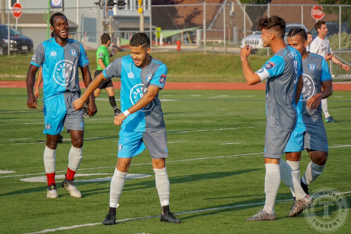
Image courtesy of Milwaukee Torrent.
8. MILWAUKEE TORRENT
Half baby blue and half grey, this kit is one of the more unique fashion statements in grassroots soccer. Two elements that fit very well on the jersey is the all white logo, that takes up the entire stomach and the alternate sleeve colors.
7. FOOTBALL CLUB ARIZONA
Yellow on a jersey is meant to be bold and stand out, a fitting style for FC Arizona. The chest is covered in a yellow block, that slowly cascades into smaller and smaller hoops, eventually becoming navy blue. The FC Arizona style of play will fascinate the audience and it will always be easy to stop the players on the pitch.

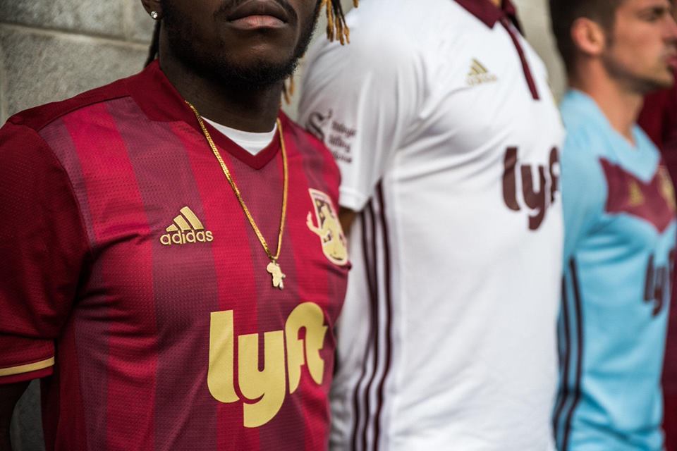
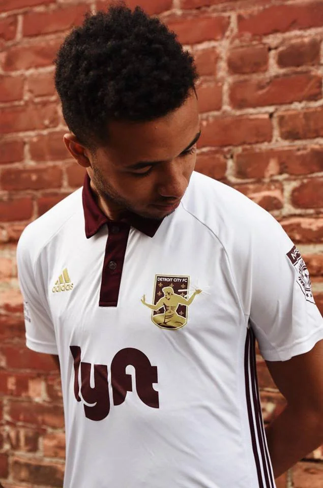
Image courtesy of Daily Detroit.
6. DETROIT CITY FOOTBALL CLUB
DCFC’s rouge color palette mixed with the gold accents, make one luxurious kit. Alternating red stripes gives the perfect canvas to showcase the jersey sponsor, club crest and kit manufacturer, but it is really those accents that just create an overall piece that locks into the clubs branding. Detroit City also carries a few alternates, like the all white with a maroon polo collar.

5. NAPA VALLEY 1839 FOOTBALL CLUB
I love a green kit and this one uses a monochromatic color scheme that just looks slick. Napa Valley’s crest has always been highly rated by those within Protagonist and this one jersey does not disappoint. The abstract design that uses the bright green and forest green steers away from a traditional stripes, like in the Detroit City jersey. The unique style makes the 1839 kit the best in the West.

Image courtesy of Chattanooga FC.
4. CHATTANOOGA FOOTBALL CLUB
The people’s club offers a perfect design that makes the thousands of fans and owners look good. The navy blue base is trimmed with baby blue to make a clean look that can fit any outfit. But what makes this kit stand out is the soccer ball outline, comprised of thick hash marks, that is located in the club’s crest. Even the round Volkswagen logo just fits perfectly on the front of the jersey.
3. NEW YORK COSMOS
Another club that is known for its iconic green jersey, but that is not the kit that gets them ranked in third place. One of the cleanest looking kits in the Founders Cup is the all navy blue base with the cascading green stippling down the chest. On top of that sweet color combination is the sharpest sleeve trim I have ever seen on a jersey. The trim is made up of the three iconic colors in the Cosmos crest: baby blue, yellow and green.
2. MIAMI UNITED FOOTBALL CLUB
The Miami United kit is one of my favorite pieces in grassroot soccer. My first ever Uniformity article was about Miami United FC. What stands out about this piece is how many unique elements lie within the kit. There are multicolored hoops, various hoop sizes, gold accents and a strong black background that helps each element pop off of the kit. The club could wear these kits for a decade and the look would never get old.
1. MIAMI FOOTBALL CLUB
Ranking in the top spot is Miami FC. The bright Miami color palette just stands out among any jersey in existence and while the club has multiple stylish jerseys, the best looking one is the pastel light blue polo with the orange sleeve. First a polo collar is the best look you can get on a jersey, it's what separates a soccer kit from all of the other sloppy sports jerseys. Second, the color combination is vibrant and reflects the community that it comes from. It is a perfect example of the art and fashion background of Miami.
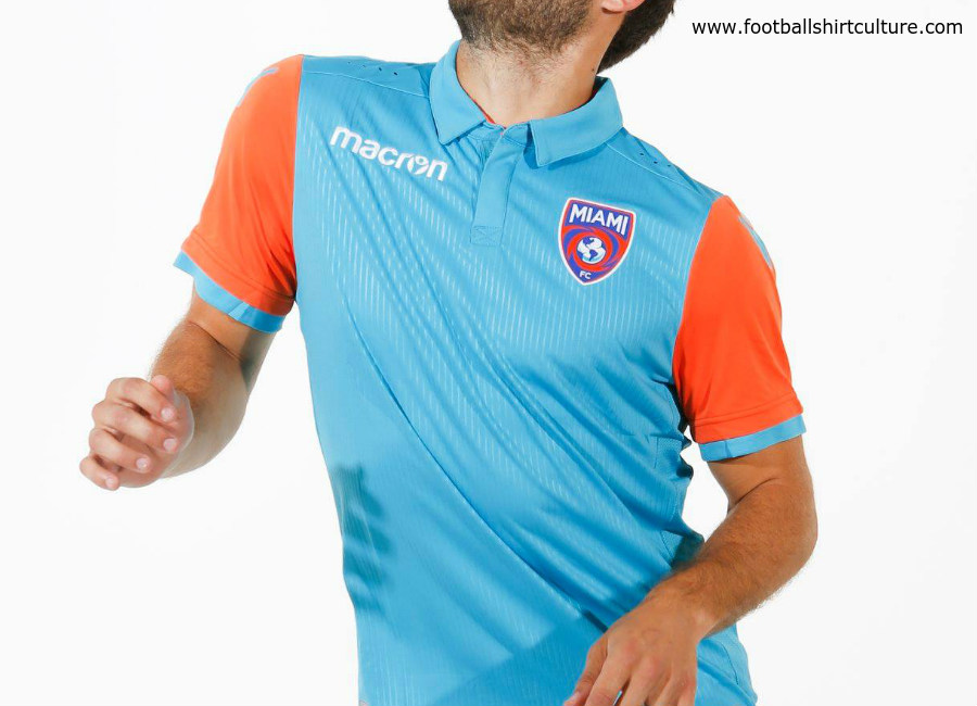
Image courtesy of footballshirtculture.com.
As we get closer and closer to the kickoff of Founders Cup, I expect clubs to create new kits for their players and fans to wear. And by that time I hope that the West Region can produce more artistic kits that really show off the powerful brands they represent. But until that day, the East Region’s brands will reign supreme.
- Steven Ramirez