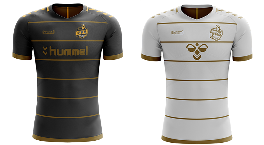
Top

Protagonist Soccer

Lower Tier Soccer | Top Tier Coverage

Protagonist soccer is a media organization dedicated to lower-tier soccer; UPSL, NPSL, BSSL

  • Home
  • About
    • About Us
    • Staff Directory
    • Join Us
    • Patreon
    • The Weekly Wrap
  • Shop
Black Bear FC.png

Black Bear FC

August 02, 2019 by Dan Vaughn

We often talk about the soccer map expanding and with new clubs popping up everywhere, from Alaska to Florida, there’s proof everywhere. One region that seems to be on a massive upswing is the South. Previously seen as American football country, the soccer game is exploding all over states previously seen as soccer deserts. One of those states is Alabama and one of those clubs is Black Bear FC. We spoke with Gavin Owens about the growth of his club and their new Icarus-designed kits.

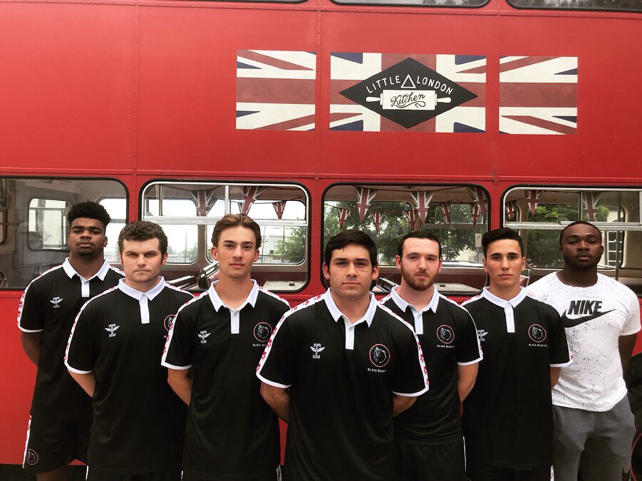
Black Bear FC hit our radar several months ago, mostly because of a classy and simple logo. The image of a roaring bear, a white outline on a black background, set within a red circle, pops in all the right ways. The starkness of the design makes it a unique and inspiring badge. It was designed by Jessica Do for the club, and the choice of the bear was not by accident. Gavin points out that “The name Black Bear FC comes from Alabama's official state animal, the black bear. I wanted the name to represent Alabama but didn't want to tie in Birmingham's industrial past. I hoped to bring a different kind of brand to our potential fans rather than imitate what a lot of businesses, and sports teams, are already doing.”

With a slick badge that already stood out, Gavin had ideas about what he wanted for the shirt design. “rom the beginning, I knew I wanted a classic collar and a black base with red/white accents. From there, Icarus FC did the rest and designed the beautiful kit you see today. The sleeves and shorts feature a white stripe with red paw prints. The back of the collar reads, ‘EST. 2019.’ All in all, we couldn't be happier with the end product.”

E5712228-7BBB-44F0-8D2F-BE31FB9E78B2.jpeg

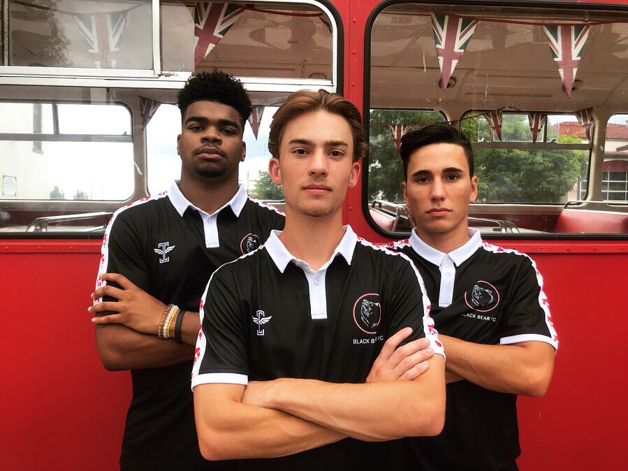
The shirt is a model of what a lower league club can look like working with a designer who tailors the work to please the client. It’s the kind of kit you can wear to almost any event or setting. It’s classy and simple, but with an air of understated sophistication. With the success of the original black kit, will there be an alternate white? Next year for sure. As of now, we will just wear the black kit in a local league that doesn't require an away kit.”

IMG_2798.jpeg

Black Bear FC kicked off for the first time recently, playing against NPSL Georgia Revolution’s Reserves. And while the new side lost 4-0, Gavin emphasizes the positives of the match. “The experience was something we'll never forget. Despite a change in the venue a day before and our biggest vendor having to back out, we still had about 70 people come support. The game was for a local charity as well called Hope To Homeless Outreach. We received lots of donations and were able to raise enough money to fund another outreach event (aka: filling bags with everyday essentials and handing them out at the homeless shelters in downtown Birmingham). We were also able to have three local vendors, all three owners are either still in college or just graduated, which was really awesome to see.” Looking forward Black Bear is looking to host more community-themed events before either playing in a local 7v7 or 11v11 league.

84F6DEAB-252A-499E-AFB4-16136392E159 (1).jpeg

They say that you have to dress the part and Black Bear FC has certainly nailed that aspect of their rollout. The club will be rolling out more merchandise in the near future, which will be in line with their current aesthetic. As far as the current kit, you can pick that up by contacting the club via twitter. The kits are $45 and will be available to preorder until August 13th.

- Dan Vaughn

August 02, 2019 /Dan Vaughn
Icarus, Black Bear FC, Kit Culture, Jersey, Design, Kit design, Kit Kulture, Soccer, alabama
Comment
3D Modeling by Aaron Flynn was used to prepare the club’s kit release image on social media.

3D Modeling by Aaron Flynn was used to prepare the club’s kit release image on social media.

Designing PDX FC

July 19, 2019 by Dan Vaughn

PDX FC, of the NPSL, has worked with Hummel as their apparel provider since its founding in 2017. For the first two year, the club proudly wore the Danish brand’s standard Core SS soccer jersey. However, behind the scenes they were working with Hummel to put out a custom jersey which accomplished two things: kept within the guidelines of their branding, to connect to the city of Portland, Oregon and to release a shirt that somebody on the other side of the country would want to wear. Mission accomplished.

The shirt was released mid-week sometime in May and within 48 hours, some sizes were sold out—this was unexpected and more shirts had to be requested from Hummel to fulfill the orders. Orders had shipped out to New York, California, and as far as Argentina and England. For something which took nearly a year to be completed, it was a bit of surprise to see the positive reactions. They knew the design was sophisticated but fell within the comfort zone of soccer fans, but really, the kit was always meant to lend the PDX FC squad an identifiable on-pitch branding.

Since the new kit’s debut, PDX FC have beat their Portland rival twice – it might be one to keep

Since the new kit’s debut, PDX FC have beat their Portland rival twice – it might be one to keep

From the onset, the club had always worn black and gold, with white as the alternate top. While some soccer fans love all black kits, others think they’re just a marketing gimmick and that clubs should stick to their team’s colors. For PDX FC, this is both and the results are elegant and original. Despite having reworked their badge in 2018, the team’s owners, Luke and Max Babson, insisted on sticking with the original colorways and it was a great choice – few clubs have a badge and a kit which stand out as original and professional.

From discussion early on in the discussion of a custom-designed soccer jersey, it was an imperative to make sure the design for the home shirt wasn’t too experimental, and worked within the norms of what soccer fans are used to seeing. Fans in Portland have always coveted a “Hoops” look and at the onset of planning, it was decided to go that route, but use subtlety rather than a big bold design to accomplish this. Sketches for both a black kit with gold trim, as well as a white kit with gold trim, were submitted to Hummel to create test kits. Both Alfonso Poblete, of Santiago, Chile and Portland soccer supporter, Aaron Flynn contributed to creating the 3D modeling which gave Hummel the guidance to create their mock-up templates.

This initial 3D modeling by Alfonso Poblete, was beautifully done and selected from a handful of images he produced for Hummel to create their mock-ups and tester kits.

This initial 3D modeling by Alfonso Poblete, was beautifully done and selected from a handful of images he produced for Hummel to create their mock-ups and tester kits.

When the test kits arrived in the fall of 2018, it was decided that the colors might need a slight adjustment, and that the club wanted to make space on the shirt for sponsors – this meant that the plan for sublimation and production had to wait until the sponsors and their respective location on the shirt had been decided upon. If you work in soccer in America, at this level, then you understand that this had the potential to be a lengthily postponement, but absolutely necessary to ensure that the sponsors would be well-represented on the shirts and that no additional printed would have to be done, getting all branding sublimated would be cost effective and ensure the longevity of the branding on the shirts.

Hummel turned the original sketches into pre-production kit mock-ups. Only one each of either shirt was ever made.

Hummel turned the original sketches into pre-production kit mock-ups. Only one each of either shirt was ever made.

By early Spring 2019, the sponsors’ location on the shirt had been decided upon and the final draft was sent off to Hummel to produce the primary kits. Budgets at this level of soccer are tight… like, very very tight. So only one of the two designs could be made. The owners went with creating a custom “home” kit first and sat on the design for the alternate, or “away” whites. Instead, they stuck with the tried and tested Hummel Core SS and added a couple of Hummel’s keepers kits to the order. In that time, PDX FC’s season began and they would be found wearing the alternates, which they luckily already had.

As the weeks went by, anticipation grew, everyone was eager to see something which took so much care to finalize. Finally, the call came in from the owner that the shirts were in, and that they looked as amazing, if not better, than expected! The announcement was made on social media, the product was added to the club’s online shop and before their first match in the shirts, they had sold out of a couple sizes and generated a little excitement. Since their release, the club have picked up a few wins in the league and looked pretty good doing it!

- Joshua Duder

PDX FC, of the NPSL Northwest, look good and feel good in their black & gold Hummel kits.

PDX FC, of the NPSL Northwest, look good and feel good in their black & gold Hummel kits.

For more information about PDX FC, or to check out their online shop: https://www.pdxfc.com/

July 19, 2019 /Dan Vaughn
PDX, Portland, NPSL, Soccer, Hummel, Design, Soccer kit, Kit culture, Jersey
Comment
 

Protagonist Soccer LLC © 2023