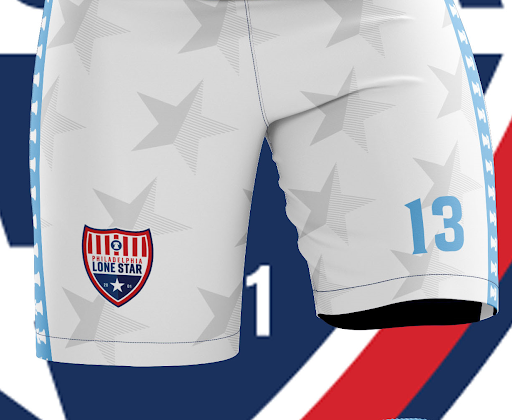
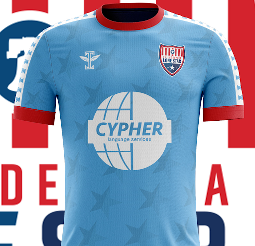
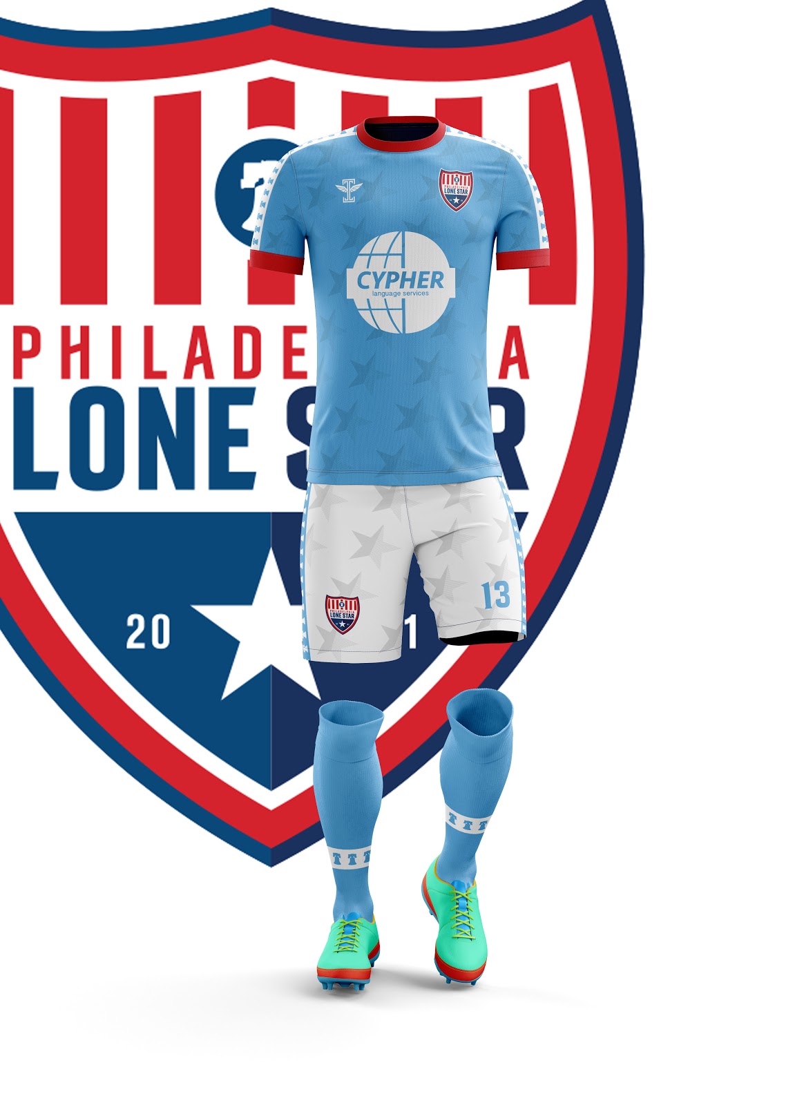
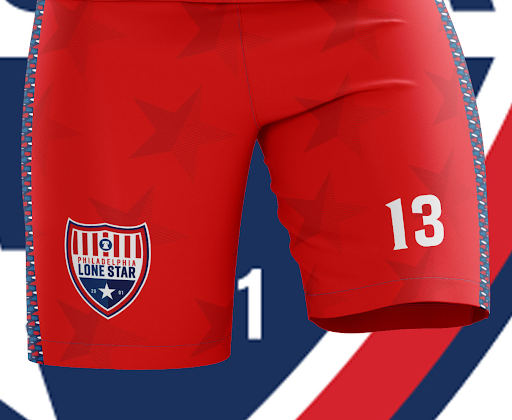
Rebranding for Authenticity

For clarity, Icarus FC does advertise with our site. It just so happens they keep making the freshest kits!

If you are not living in the Philadelphia area, you would be forgiven for thinking Lone Star FC was a Texan club. However, anyone in and around Philadelphia could tell you that Philadelphia Lone Star FC is an absolute institution in the city. The club was founded as Junior Lone Star FC in 2001 by Liberian immigrants, whose heritage is drawn on as inspiration for the “Lone Star” name referencing the lone star on the Liberian flag. The club has come to be known as one of the foremost professional development clubs on the east coast, growing from a single squad when it was founded to a club that fields teams in the NPSL’s Keystone Conference and the UPSL’s Northeast Conference. They’ve provided Philadelphia’s amateur footballers, and in particular those of African descent and heritage, with countless opportunities for further development in the sport.

This connection to Philadelphia fueled the club’s desire to rebrand last year and they adopted the name Philadelphia Lone Star. The club adopted a new crest to go along with its new name, ditching a “Barcelona”-shaped badge in favor of a cleaner pointed shield. The crest is not only a slick design, but it also does a simple design in a way that does not feel overly generic or unimaginative. The Liberty Bell is a simple homage to the city these players now call home but the club has not abandoned its own history in the process.

Philadelphia_Lone_Star_FC_logo.png

Lone Star FC took this connection to their city a step further as they prepared for the 2019 season by linking up with local kit designer Icarus Football. “Philly Lone Star is a big name around here,” said Icarus when asked about the partnership. “We really wanted to make sure we put together kits that would reflect their stature in the community.”

Based on the badge above, it would have been fairly simple for Icarus to look at this as a straightforward project. Red, white, blue...there’s 10000 high school, college, amateur, and professional soccer teams (not to mention the National Teams) in the US that use the same color scheme. Lone Star getting the template treatment that we see so often in major club and international football would have been simple. Icarus did not take that route whatsoever as they produced four fantastically unique kits.

Home

The impressive thing about this home kit is that it feels both familiar and unique all in one effortless stroke. Wearing sky blue with white shorts could have been a chance to look like a Manchester City copycat, but the Liberty Bells down the sleeves and sides of the shorts evoke a Philadelphia version of the classic Kappa designs from Serie A. The red trim pops in a way that you might not expect against the light blue, while the sublimated Star design makes it so Philadelphia Lone Star is embodied throughout the kit. An impressive effort from top to bottom.

Away

The Away Kit is another stunning effort. The red-over-red with the sublimated stars ties this design back to the home kit but it is the pattern on the sleeves and down the shorts that is the true star of the show here. We have seen, especially with Nike’s recent templates, the effort to make different colored sleeves the unique element of a kit. Icarus has taken that idea and cranked the creativity through the roof, implementing a pattern inspired by West African fabric patterns to create something truly splendid.

Third

Philadelphia Lone Star’s Third Kit serves the dual function of being gorgeous and aiding a worthy cause. During the middle of the NPSL season, Lone Star will wear this kit in conjunction with a campaign to raise money for juvenile cancer research. Such a campaign should succeed on its own merits, but this design is a fantastic advertisement. The pink and black color scheme has an extremely modern feel to it without it feeling garish. The black and white version of the crest is, quite frankly, badass. The star details down the sleeves and shorts add a nice touch, but the sublimated design again steals the show, with a lovely hoop design culminating near the collar in the Philadelphia skyline. A kit that accomplishes this much both aesthetically and in helping those in need is extremely admirable and I hope this kit gets the attention it deserves.

Fourth

There is something so striking about a well-executed white kit. When that kit has a sublimated spotted print and a unique pattern down the sleeves, you have something special on your hands. The aforementioned pattern extends from the collar, down the sleeves, and down the shorts, with the numbers on the kit itself containing the pattern as well. This kit again brings Lone Stars African roots to the forefront. This celebration of the club’s heritage is evident in each design but this particular design feels like a celebration in and of itself. I, for one, am extremely here for it. This kit will act as a fourth kit for the NPSL squad and will serve as the UPSL squad’s home kit. This may be premature, but I would shortlist this kit for one of the best in UPSL for the Spring Season.

Philadelphia Lone Star FC are embarking on a new chapter of their history in 2019 and with this new identity that links their current home to the club’s African heritage, the club is emphasizing what we all love and idealize about the United States and the game of soccer: The opportunity to succeed no matter your background. This club is admirable for its ideals and history, and now we can all look on and admire the kits as well.

- Phil Baki


Dallas City FC: A Tradition of Style

During this Thanksgiving week we all take a look at all the things we are thankful for. Personally, I am thankful for my friends, family, and of course American soccer. While a few jerseys hang in my closet, I have multiple U.S. National Team jerseys. I definitely understand the multitude of  problems within the federation, but there is a sense of pride when I represent the Stars and Stripes. While digging through social media and the various clubs within our lower league system, I stumbled upon one gem that combined my love for the red, white and blue and my love for lower league soccer.

Dallas City FC was established in 2013 and has played in various leagues while earning multiple trophies. In 2014, Dallas was crowned spring champion of the Metro Soccer League and in the same year won the Trinity River Cup, beating the Fort Worth Vaqueros in two-legged affair. It went on to join the NPSL for a few seasons and currently competes in the UPSL Central Conference North Division.

Dallas City Futbol Club has a rich history of sporting fashionable kits, but always represents the red, white, and blue. In 2017 its kit was an inverted version of my favorite U.S. National team jersey the “bomb pop.” Dallas' version saw the bottom and main body of the kit all blue, a white stripe at chest level, and red around the shoulder and collar. The club also sports an all white alternate that is filled with lightly tinted red and blue stars.

This year’s kit lives up to Dallas City FC's remarkable line of jerseys. From the bottom up, blue and red stripes alternate until they reach chest level where the lone white stripe sits. Within the blue stripes lay blue stars that shine from a distance, while the red stripes offer a great contrast that helps the kit pop. My favorite element is the subtle Dallas skyline within the white stripe, a traditional element within many of the club’s jerseys throughout the years.

17426368_736318499878873_8967990639527601014_n.jpg

I tend to look at its kits in the eyes of an American soccer fan. I see the elements of our country’s flag and think of how it reflects my favorite soccer team, the United States National Team. But for citizens of Dallas and all Texans alike, this kit has more than just country pride; it's also a reflection of their community. We've all seen the Texas state flag and if somehow you haven't, just peer at the Dallas City FC crest. Dallas' city flag is similar to the Texas flag, but one focus is on the horizontal split between the red and blue tones. This white hoop traverses the whole map, similar to multiple Dallas City FC jerseys.

42827683_1063781960465857_7134095503637086208_o.jpg

All of these elements key on to the essence of branding a soccer club: reflecting your community. Of course many fans from around the country can look at this kit as a cool alternate to wear on National Team game day, but a Texan can wear it everyday as a symbol of pride. Pride for their city, pride for their state and pride for their local soccer club. For Dallas City FC, the process of creating a jersey has never been an as easy picking a template and running with it. With each year and each kit adding to a tradition- a tradition of style.

- Steven Ramirez