New Look Same Club
The identity of a club is often overlooked, but often it plays an essential role on how we feel about a club. A fan should embrace the identity, but a player must live with it and become an ambassador for that said identity. That is why the crest of a soccer kit lays over our hearts. A brands identity is one with the fan, the player and the community.
“The new uniform will give us a breath of fresh air.”
In this week’s Uniformity we travel to Perris, CA to check out the new brand refresh for City Legends FC. City Legends FC is a sophomore club within the UPSL. In its first year the club went undefeated in the Championship and were promoted to the Pro Premier. The club’s identity wasn’t bad. It had a well done crest and a color palette that sticks out in the soccer world: maroon and gold. But 2019 was meant to be a bigger year for the club, and a bigger year meant an even better presentation. “ Once we jumped up to the Pro Premier, we didn't start off that great,” said Anthony Perez about the new year and new identity. He added “ I thought a refresher, the new logo and new uniforms, would spark us up again.”
The Crest

The original crest had a unique shape and was drenched in maroon, the clubs primary color. It was a bold crest fit for the desert city of Perris, CA. The bandit became the icon for the club, equipped with his western style cowboy hat. The crest itself gave the team an identity, but just because something works doesn’t mean that it can't get any better. Because it did.
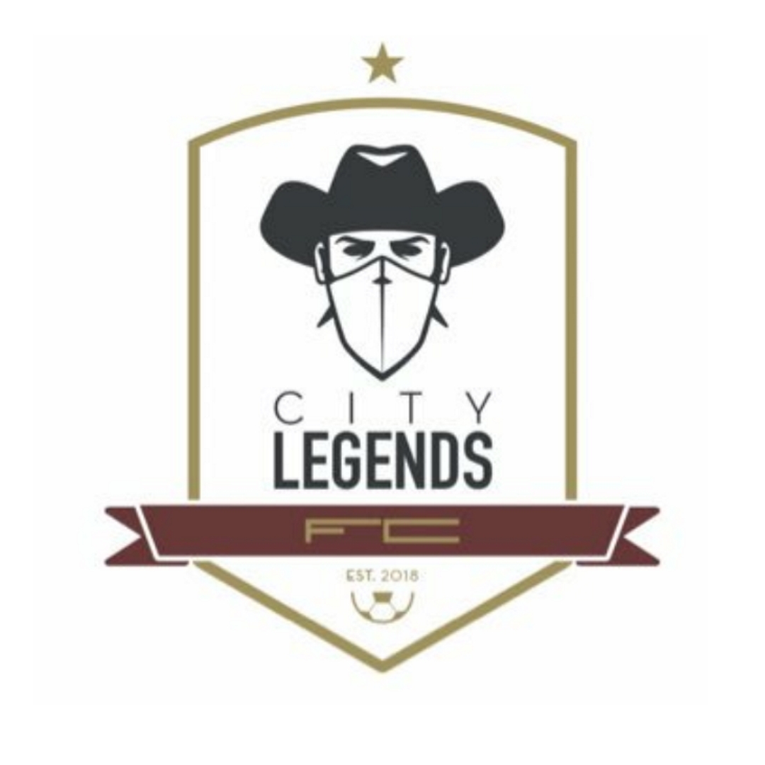
The new crest is sleek and designed in a minimal fashion. Every adjustment has made this crest more appealing. The shape is more defined and offers a stronger frame. The maroon acts as an accented color, rather than dominating the space. The use of negative space helps the badge breathe. The font variances help create symmetry and balance within the piece. And the bandit still makes his appearance, but he is bolder and more experienced because he has that undefeated season under him.
“We wanted to keep the base of our logo, so we just freshened it up a little. We made look cleaner. We made it look sleeker.”
The Uniform

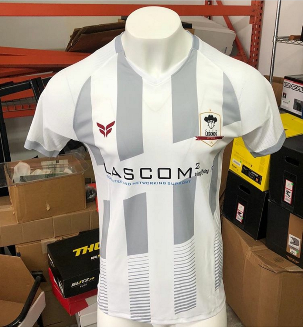
In soccer a new season often means a new uniform. Most pro clubs will often trot out different color variants to the same template, but in grassroots soccer you often see an explosion of creativity. That was how Uniformity was born.
The new City Legends uniforms look great. The design is sleek and matches the new identity that the club is creating. The alternate colored stripes give a classic feel to the kit, but the fade at the bottom gives a cool modern twist to the outfit. One element that stands out is the diagonal hoop. It’s just another element that slightly changes the jersey traditions of old.
My favorite is the white, mostly with how well the badge fits in and how the maroon accents just give another strong element to look at. Those two extra elements provide a balance to the overall kit that the black can’t match.
The new design helps to usher in a new era for the City Legends. An era that has attracted a jersey sponsor in Lascom IT, who believe in the project that this club is creating for its community. A new uniform isn’t always about style, but about growth. City Legends Football Club is stepping away from being a soccer team and stepping into the identity of a soccer program. A soccer program that has the potential to truly develop a soccer community.