An Uncorporate Approach to Design
Certain clubs get it.
They just have the right people in leadership to make the important decisions. Those choices show up in the coaching staff, on the field, in the results, and, of course, in the branding. Oftentimes, branding gets mocked at the grassroots level, because it’s a buzzword that is tossed around to shield a lack of results in the level of club performance. But it’s part of every successful club at every level. Branding is important and having the right leadership at a club will yield results in this area as well.
MPLS City is entering their fifth year as club, their fourth as a member of the NPSL. Known for their outspoken and often tongue-in-cheek take on social media, the club has approached every part of their club with the goal of being “uncorporate soccer.” Decisions are made with passion and vision, often running counter to an approach that a more conservative club might take. Club co-founder, Dan Hoedeman, has been a big part of this stance and his approach doesn’t always follow traditional thinking - “being rational isn’t everything and certainly not in what is, inherently, an irrational business.”
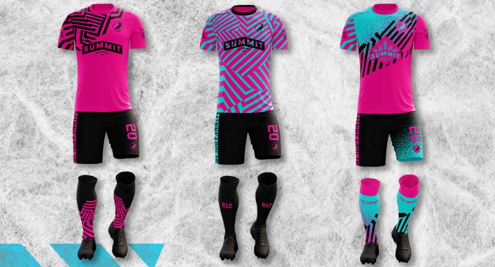
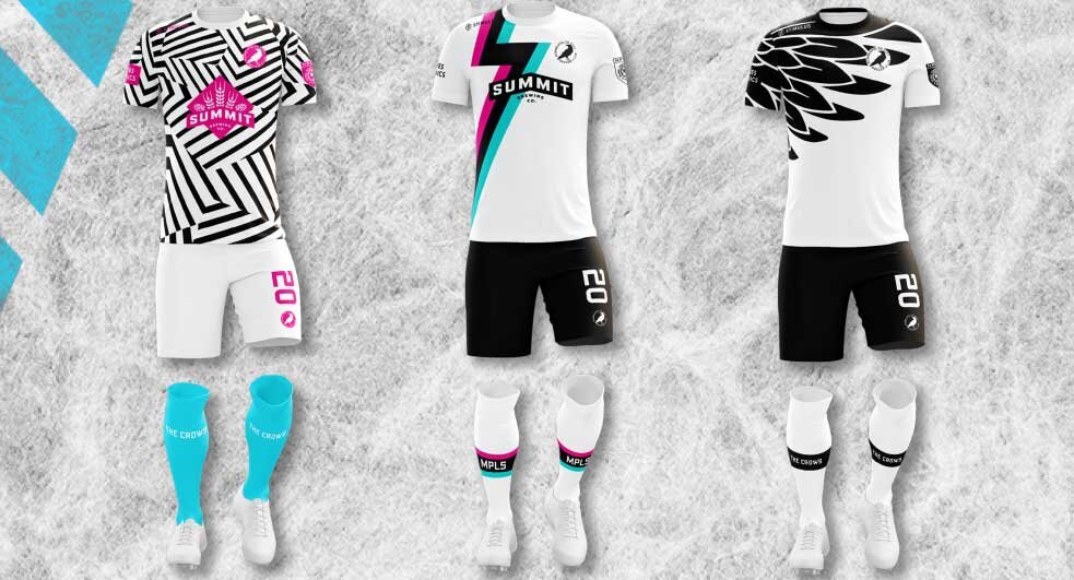
Just this week, MPLS City released the results of member voting on their newly designed 2020 kits. The options were heavily discussed online and everyone had a pick, but only MPLS City members had votes. Designer Matthew Wolff was recruited to do the design work and his 6 kits (3 home, 3 away) offer a little bit of everything. “Every kit design project is different. Some design constraints are set by the league, the club, or the manufacturer. Minneapolis City are usually eager to push the envelope when it comes to design. It's an opportunity to differentiate from the often templated club kits we see from the low-level to the pro-level in this country.”
Wolff is based in New York, but has Minnesota roots. “I grew up in Minneapolis so the city and club are near and dear to me. I've been in contact with Dan and the team since their inception and try to lend a hand wherever I can. I have some high school buddies that play for the club so although I live in New York now, I'm always tuning in.”
Honestly, the members couldn’t go wrong in their voting because these kits are spectacular, but four had to lose. My personal favorite, for what it’s worth, was one of the winners. Reminiscent of the old NASL Loons kit (that somehow, stupidly, the club did away with when they went MLS), the feathered design stood out, highlighting the club nickname, The Crows. For the away, the neon-colored design may be the brightest in grassroots soccer and will definitely catch the eye of every away fan.


Wolff offered a look into his design inspiration. “Dan [Hoedeman] described the MPLS City brand as "charmingly illogical and powerfully unexpected" -- and my goal was for the kits to reflect that. I brought an asymmetrical design to both the home and away kits, again, to mirror the ethos of this lovably ramshackle minor league club. I also brought cyan into the away palette for the first time in the club's short history. It provides an eye-catching contrast from the pink and black.”
The theory of uncorporate soccer should inspire all clubs to think outside the box and find new avenues of inspiration. Aspiring to be more than “normal” can make your club a leader. Dressing the part is only the first step, but Matthew Wolff’s designs, inspired by the approach taken by Dan Hoedeman and the MPLS City organization, are a very IMPRESSIVE first step into 2020.
Both kits are available for preorder at the MPLS City club shop online.
- Dan Vaughn