A New Look Rooster
As the years come and go, a team will begin to notice when it is time for a change. Having finished one position from a playoff spot for three straight seasons, the past two being only three points away, the Rhode Island Reds have reached that time for change. They began play in the 2012 NPSL season and, after 7 seasons, the Reds are looking for their first playoff opportunity again this year. With that optimism, Kabba Joof, the founder and chairman of the club, along with club President Rubin Paz and head of Community Outreach Mike Simeone, have decided to go with a fresh start for a new chapter in the team's story.
The original logo.
The team is named after the Rhode Island state bird and the badge maintains the Red at its focal point. They have received their new look badge from graphic designer @danygraff. They have maintained the 13 stars representing their home as the 13th state, the anchor from the Rhode Island flag, and the 2012 inaugural season on their badge. The club website explains why it kept many of the same elements during this change. The new look reflects the work that has been put in by the players and staff and they hope that by keeping the key elements they are "ensuring a level of respect, family, hope, and positiveness to its Players, Fans, and Volunteers of all levels while still maintaining the symbolic Rhode Island State symbols."
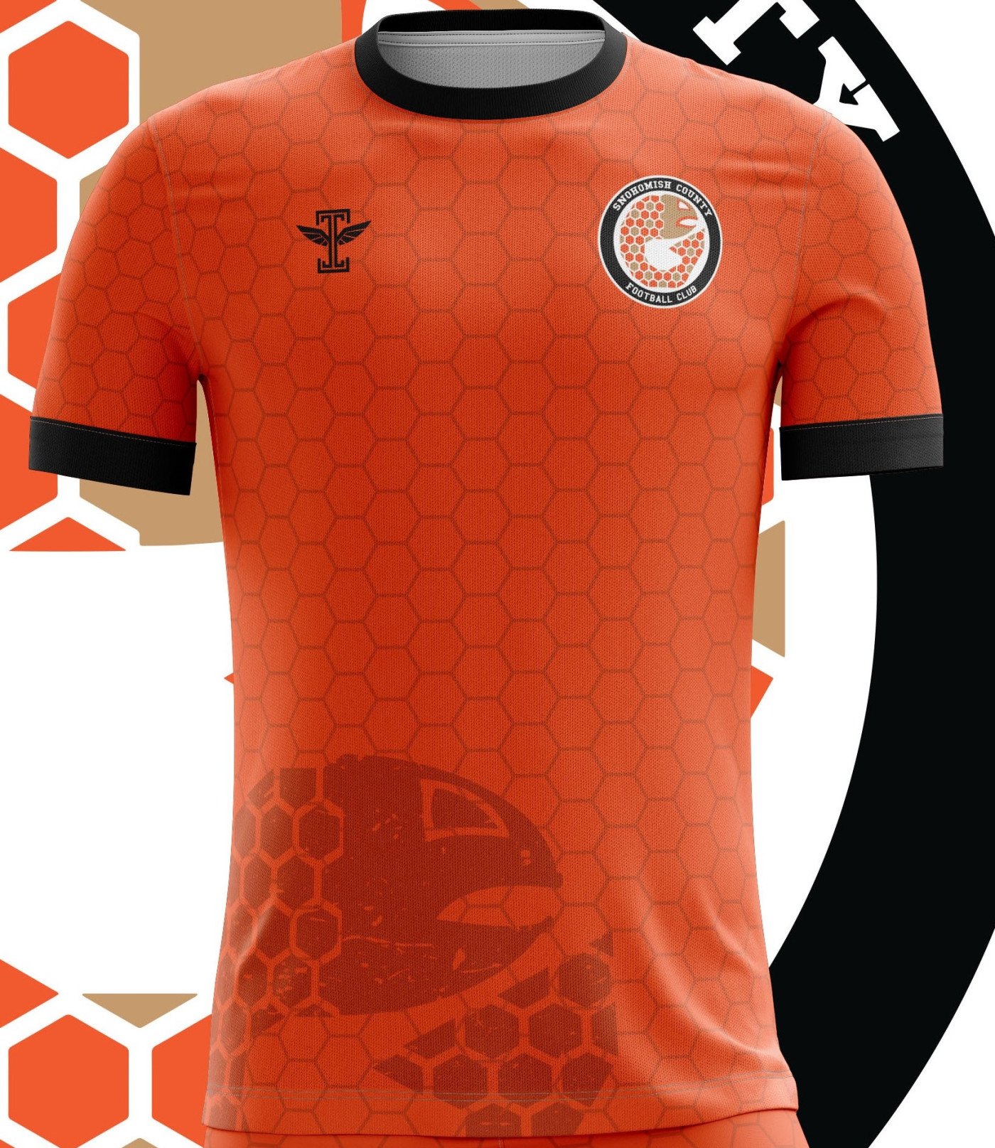
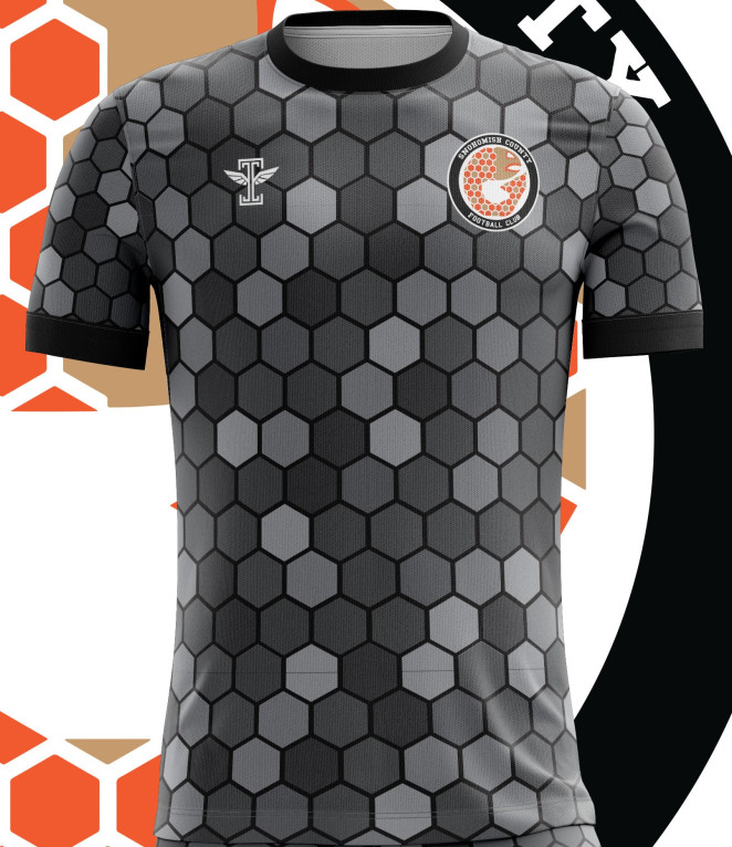
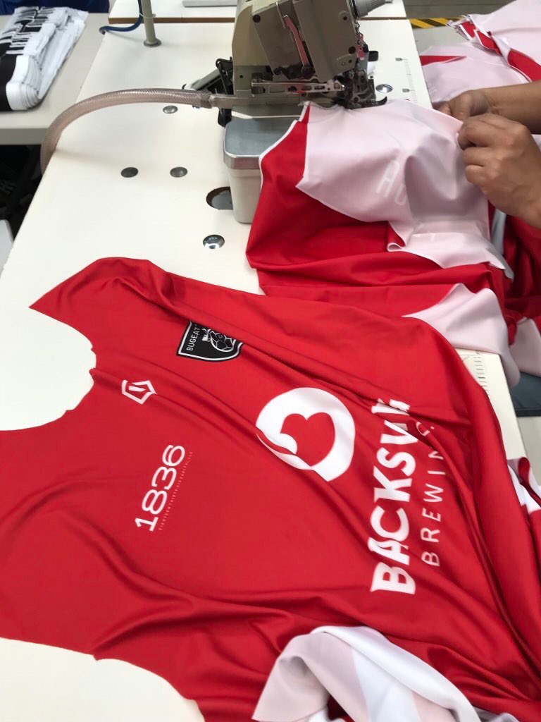
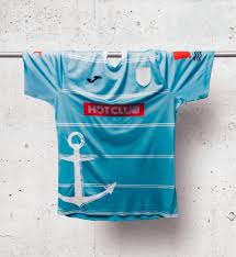
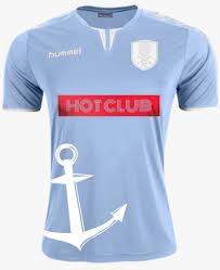
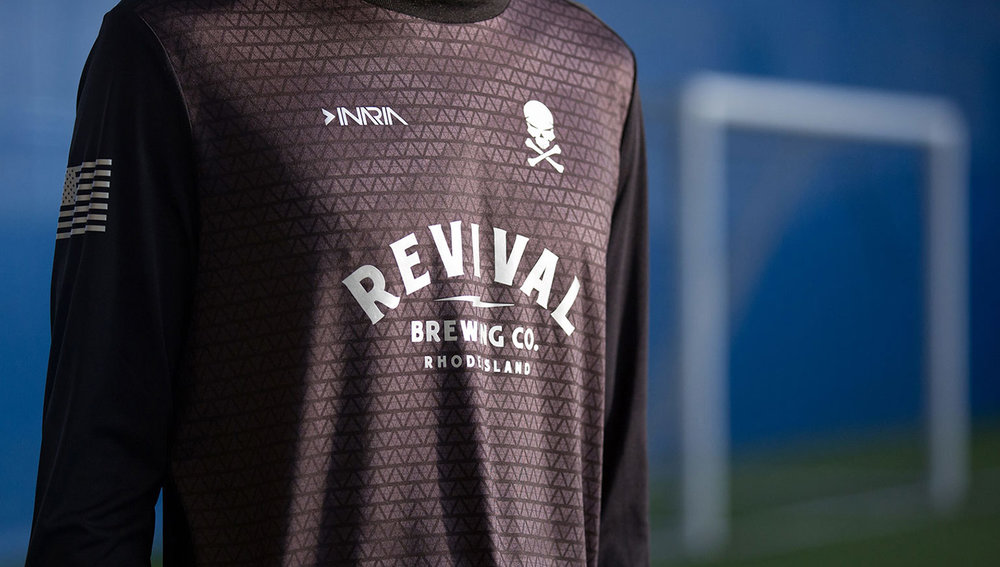
The club has teamed up with the Portuguese brand G-Sport to produce its shirts for a second year. They have taken the idea of change and completely revamped their look. As Kabba explained, "If new logo design, why not a new shirt." They have moved from last year's plain red or blue and yellow blocks of color to bold new patterns. Working with G-Sport allowed the Reds to create the shirt the way that they wanted. Kabba explained that he is generally more conservative in his soccer, but Paz, a Portuguese American, saw this as a chance to work with a company that has produced many shirts for amateur clubs in Portugal. Even though he was "concerned about getting too close to the edge" he likes the shirt because it is different. The Reds are the first team in the United States to have kits from G-Sport and sees this as the next step in their efforts. G-Sport has worked with smaller soccer teams and as Kabba put it, all aspects of the "game starts on the grassroots level."
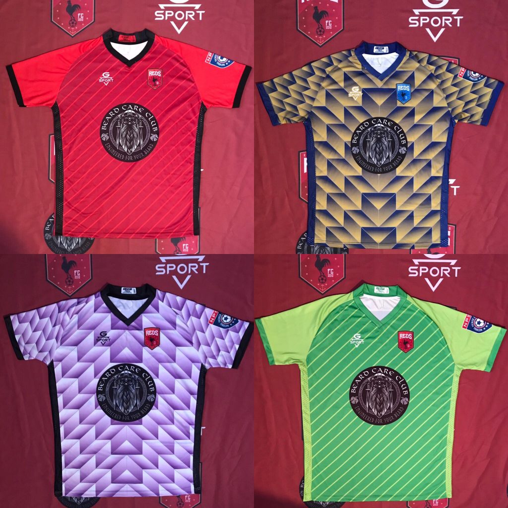
The new kits. Image courtesy of Rhode Island Reds FC.
Last year, they gave their title sponsor spot away to a non-profit: the March of Dimes. Their main sponsor this year is Beard Care Club. They saw this partnership as a chance to show their growth and their connection to the community. The owner spent the 1990's in New England after he left the army and has maintained a friendship with the club. "My family and I have been football (soccer) fans as far as I can remember. When we were approached about the possibility of being a sponsor for the Rhode Island Reds FC we were ecstatic and had to jump on it," owner Donny Salazar said in the press release about their partnership.

Club players trying on the new kits. Image courtesy of Rhode Island Reds FC.
The Rhode Island Reds believe that they have improved on and off the field. The organization and team are evolving from one of the older teams in the Northeast and NPSL as they step up their game.They are using their history and belief in the bottom-up development of soccer to promote their future.
Their shirts are available at their website and if interested, they still have a few tee shirts available with the old logo as well.
- Andy Rittenhouse