Kick It Off With a Bang

During the winter months, leagues take care of all the business that the regular season crowds out. League meetings, player tryouts, kit redesigns, almost anything you can think of happens when the weather outside is inhospitable in most parts of the country. One of those pieces of business is adding clubs. Whether through introducing a brand new club or adding on an established club who is jumping from one league to the next, expansion offers a spotlight on clubs, mostly through their crests (because most have a limited track record on the field). With all the announcements from league after league, we decided to put together a short list of some of our favorite badges from expansion sides this winter. Enjoy!
- Dan Vaughn


Dan Vaughn

Website-announcement-773x380+(1).jpg

Louisiana Krewe FC - Lafayette, LA - GCPL

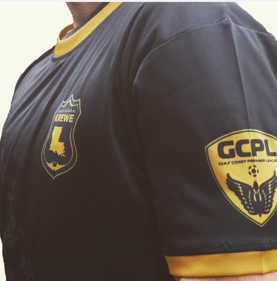
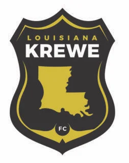
I’m a sucker for maps. The shapes of states, cities, countries, you name it, love that stuff. This crest features the shape of Louisiana on a gray/black background. The name of the club is featured above the state with the smaller “FC” below. Rather than a round shape, the crest is almost the shape of a police or fireman badge, with the three points on top and the single point at the bottom. The colors are very much in line with the NFL’s Saints, connecting the club to familiar territory for Louisiana sports fans. By the way, Krewe is a term for a group of people that put together a float in a carnival (much like in Mardis Gras). It’s a sharp badge and I can’t wait to see the uniforms that will feature it.

Steven Ramirez

1543361837_a.png

AC Miracle Hill - Desert Hot Springs, CA - UPSL Western Conference

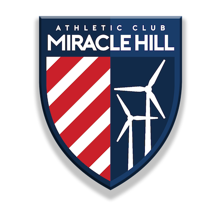
If you live in Southern California and have made the drive through the desert, you have been faced by many giants that ruled in Don Quixote's time. The Southern California desert hosts a wind farm that contains over 4,000 windmills and is known to many travelers. When creating a crest for this Desert Hot Springs club, nothing makes more sense than those towering windmills. Using the “Athletic Club” moniker applies a traditional naming convention that is sporadically used in the world, especially in the U.S. soccer sphere. In their first year of existence this UPSL crest jumps out as one of the best in the league.

Aarik Long

220px-Chattanooga_Red_Wolves_SC_logo.svg.png

Chattanooga Red Wolves - Chattanooga, TN - USL League One

I was at Edley’s BBQ on November 15th to witness to unveil of this logo for Protagonist Soccer.  The atmosphere inside of the restaurant was incredible. When the crest was finally unveiled, there seemed to be a positive response inside the building. However, people have seemed to not agree online. It’s been mocked repeatedly, but I think it’s a great crest. To begin with, I love that red is the primary color. It’s pretty common and maybe a little cliche, but there’s nothing like a cross-town, red vs blue rivalry. The wolf looks great. It isn’t a goofy cartoon canine, but it also is not overly realistic. The overall shape of the badge looks really nice, as well. The spikes at the bottom aren’t very common among crests, so the unique shape is refreshing. Some of the reasonings behind different parts of the logo seemed like a little bit of a stretch, but I think the crest itself is extremely solid and among the best in USL League One.

Dab Williams

CCFC_Logo-e1538156738340.png

Contra Costa FC - Concord, CA - UPSL

The round of expansion teams for Spring 2019 hasn’t impressed me much, honestly. Don’t get me wrong, they might be great on the field, but artistically and stylistically I’ve been underwhelmed. Contra Costa FC was a breath of fresh air. CCFC’s badge is in the shape of the Union Pacific logo and features a similar design with the white and red stripes across the base of the badge.  The top of the badge features some mountains, the name and, outside the limits of the badge, is the star, which I assume is from winning the Liga NorCal Copa Cup championship in May 2018. Across the front of the crest is a soccer ball with wings (not my favorite feature of this one), completing the look of the badge. I love the color palate, love the shape, it’s the best of the UPSL expansion clubs, without a doubt.

Dallas City FC: A Tradition of Style

During this Thanksgiving week we all take a look at all the things we are thankful for. Personally, I am thankful for my friends, family, and of course American soccer. While a few jerseys hang in my closet, I have multiple U.S. National Team jerseys. I definitely understand the multitude of  problems within the federation, but there is a sense of pride when I represent the Stars and Stripes. While digging through social media and the various clubs within our lower league system, I stumbled upon one gem that combined my love for the red, white and blue and my love for lower league soccer.

Dallas City FC was established in 2013 and has played in various leagues while earning multiple trophies. In 2014, Dallas was crowned spring champion of the Metro Soccer League and in the same year won the Trinity River Cup, beating the Fort Worth Vaqueros in two-legged affair. It went on to join the NPSL for a few seasons and currently competes in the UPSL Central Conference North Division.

Dallas City Futbol Club has a rich history of sporting fashionable kits, but always represents the red, white, and blue. In 2017 its kit was an inverted version of my favorite U.S. National team jersey the “bomb pop.” Dallas' version saw the bottom and main body of the kit all blue, a white stripe at chest level, and red around the shoulder and collar. The club also sports an all white alternate that is filled with lightly tinted red and blue stars.

This year’s kit lives up to Dallas City FC's remarkable line of jerseys. From the bottom up, blue and red stripes alternate until they reach chest level where the lone white stripe sits. Within the blue stripes lay blue stars that shine from a distance, while the red stripes offer a great contrast that helps the kit pop. My favorite element is the subtle Dallas skyline within the white stripe, a traditional element within many of the club’s jerseys throughout the years.

17426368_736318499878873_8967990639527601014_n.jpg

I tend to look at its kits in the eyes of an American soccer fan. I see the elements of our country’s flag and think of how it reflects my favorite soccer team, the United States National Team. But for citizens of Dallas and all Texans alike, this kit has more than just country pride; it's also a reflection of their community. We've all seen the Texas state flag and if somehow you haven't, just peer at the Dallas City FC crest. Dallas' city flag is similar to the Texas flag, but one focus is on the horizontal split between the red and blue tones. This white hoop traverses the whole map, similar to multiple Dallas City FC jerseys.

42827683_1063781960465857_7134095503637086208_o.jpg

All of these elements key on to the essence of branding a soccer club: reflecting your community. Of course many fans from around the country can look at this kit as a cool alternate to wear on National Team game day, but a Texan can wear it everyday as a symbol of pride. Pride for their city, pride for their state and pride for their local soccer club. For Dallas City FC, the process of creating a jersey has never been an as easy picking a template and running with it. With each year and each kit adding to a tradition- a tradition of style.

- Steven Ramirez

Designed Beyond Regional

Designed beyond Regional

Monmouth.png

I think there’s this idea that permeates our culture. It’s not just soccer, but everywhere, this idea that if you’re regional or local, you probably aren’t as good as the big name brands that we all recognize. Happens all the time in the time when I’m grocery shopping. I skip over one brand because I don’t know it and instead pick up one that I’m more comfortable with. I won’t deny that I can think of some fields/markets where this is changing. Beer has gone through a massive revolution thanks to local guys churning out great beer as part of the craft beer revolution. But that is only a tiny part of the market, the tip of a trend, not really a market-wide changer.

In soccer, this happens when local clubs get passed over because the consumer makes the assumption that local means unpolished and not worth the investment. Again, this is changing, but incredibly slowly. Supporting local soccer has become a bit of a rallying cry for soccer fans across the country who are tired of being forced to watch international clubs or MLS sides if they want to watch soccer. So many clubs have popped up across the nation, the tiny investment of $5 or $10 can get you an authentic experience supporting a local side. Regional soccer is expanding rapidly and some of these local clubs seem to understand the importance of standards. The chance to make a good first impression is a priority for the successful clubs, the ones who get it. Having a smart badge, a slick kit, a solid social media strategy, all of these pave the path to success. All of us at Protagonist have become obsessed with one such club, a tiny regional start-up, who understand the importance of design: Monmouth Light.

THAT BADGE THO

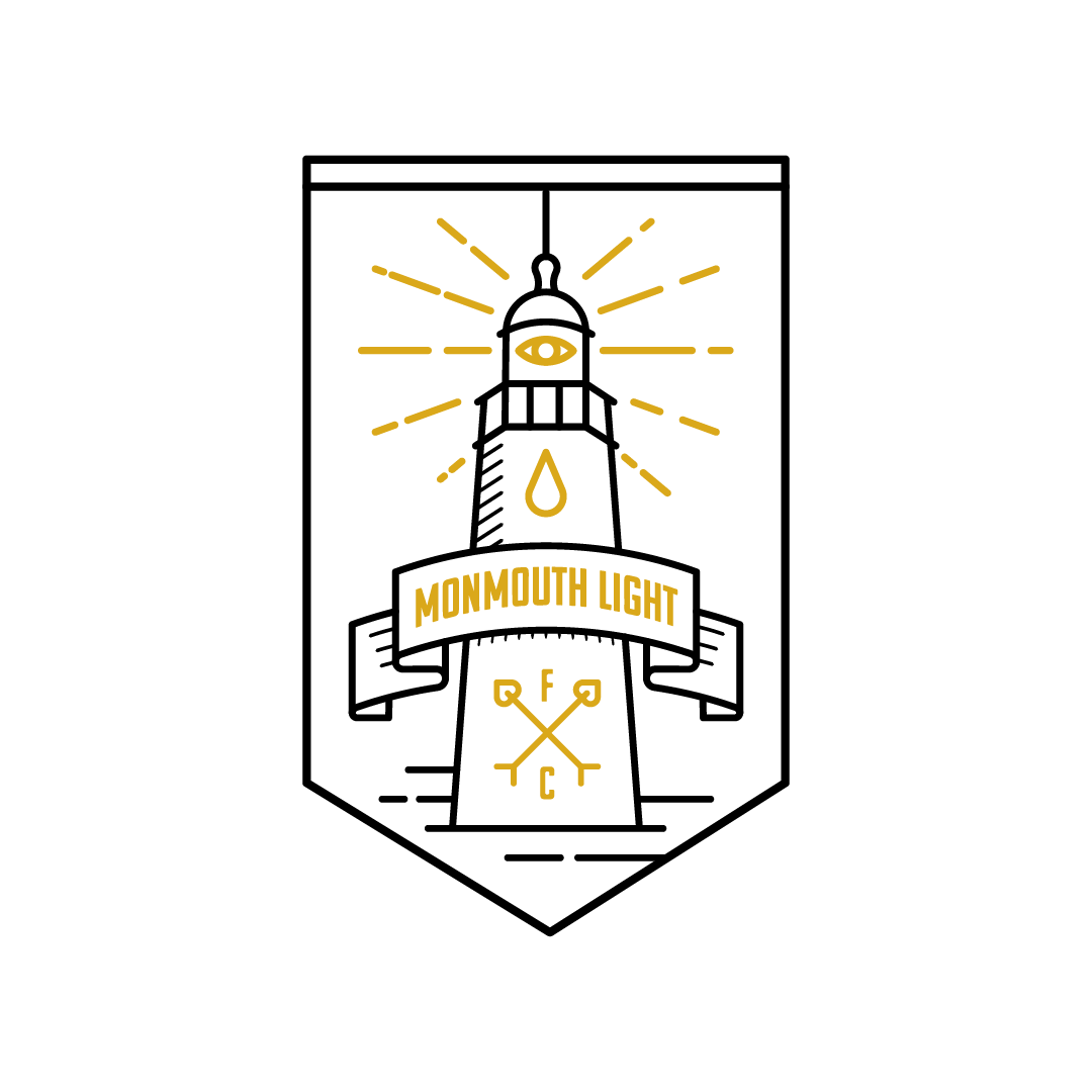
If you want an intense first-hand history of the club, I would definitely hitting up our Spotlight piece on Monmouth. But for now, let’s focus on one of the best lower tier badges in the game. Monmouth plays in the Garden State Soccer League in Monmouth County, New Jersey. That county has the most lighthouses of any county in the state, but the image of the lighthouse goes a little beyond the literal. According to Joey Dicamillo, founder of the club, “the “Light” is just actually an abstract concept for positive energy, and the All Seeing Eye on the crest and on the left short leg is symbolic of us spreading that “Light” into the world much like a cult, or the Illuminati.” Most clubs do not dig this deep when designing their crests, but maybe they should start doing it, considering how polished and sharp this result is.

The image is memorable and eye-catching, designed by London-based artist, Aimee Capstick. She primarily works with Romance FC, but took the time to generate an absolute banger of a badge. The colors are two-tone but not dull, the design is simple but still pleasing to look at. It’s a masterwork in design and should be considered one of the best in regional soccer.

THE THREADS

Disclaimer here, Rob from Icarus (who also sponsors this column) designed these kits, but if you think that shaped why we picked these kits, open your eyes. It’s one thing to look sharp on the field, these look great in every setting. As Rob puts it, “we were going for a cross between the Illuminati and the Great Gatsby.” Joey mirrors this sentiment when discussing the details of the numbers and lettering on the kit. “The Font was completely art-deco and almost 1920’s gatsby esque-again just wanted to go with pure class, and something that would be almost eternal feeling just like the greco roman design inspiration. Aesthetically I was going for a very classy look, wanted to have a slight call back to my mom who came to America from Rome, there is a slight greco roman style vibe in the all over print on both kits.”

This isn’t just a soccer kit, this is a badass shirt that can be worn anywhere with pride. It’s sharp, it’s modern, it’s throwback, it’s all those things and maybe something more, it’s regional.

THE WRAP

It’s easy to write something off as regional, lower-tier, amatuer, whatever insult you want, but when it looks this good, this polished, this well-designed, it’s difficult to ignore. What Icarus and Monmouth have created here is a work of art that can’t be ignored. There may be better kits when it comes to how they look on the field with a set of shorts and cleats, but I challenge you to find something that looks cooler than this beautiful piece of regional soccer. This guy certainly thinks so.


Designing for a Nation

It’s true that at Protagonist Soccer, we try to stick to the lower league clubs that we love so much. That’s also true of Uni-Formity, as a general rule. But it’s the weekend, so let’s break some rules just this once. One of my favorite arguments is about the national team design, so today I’m going to lay out my top five US National Team kits in descending order. While the USMNT has been far less successful than the greatest national team (USWNT), my memories are tied to the men’s side, so that’s what I’ll stick to. Regardless of my choices, I’m sure you’ll disagree, and that’s ok. Promise.

#5 - The Denim Design

Photo by Patrick Hertzog/AFP/Getty Images

Photo by Patrick Hertzog/AFP/Getty Images

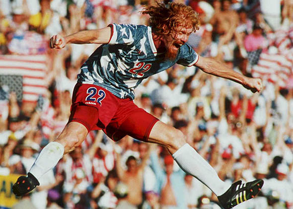
If you haven’t listened to American Fiasco, the podcast about this era of the USMNT, you should close this tab and open a new one. This era was one of the most interesting ones, with drinking, gambling, and teammate wife drama. Really, really great podcast. Back to the kit. This kit was rolled out in advance of the 1994 World Cup, hosted by the United States. The kits weren’t actually made of denim, it was just printed that way. There may be no kit more lampooned than this American classic, but as Alan Seigel put it in his article on Slate, “…as outlandish and stonewashed as it appeared, the design did capture the state of soccer in the United States.” I’ve grown to love this icon of kit design. It’s crazy, a little ugly, and certainly not the crisp lines and colors I praise so often, but it’s American as hell, thank you very much.

#4 - Stars and Stripes

Photo by Ezra Shaw/Getty Images

Photo by Ezra Shaw/Getty Images

I have friends who hate this kit. They are wrong. This was a special edition kit, released for the 2017 Gold Cup competition. The kit featured red and blue stripes down the body, with subtle darker stars within the blue stripes. Down the shoulders and on to the arms runs a series of stars that really tie in the feel of the American flag. As a big man, I would never wear this kit, as horizontal stripes aren’t kind to my body shape, but for a player fit and ready for competition, this is a sharp look. And let’s not forget, we won this competition. Maybe because of a good luck charm?

#3 - The Sash

Image courtesy of US Soccer.

Image courtesy of US Soccer.

Ah, the 2010 World Cup. Will we ever be as excited as we were that year? Maybe it was just me, but I was a true believer in this club. Dempsey, Donovan, Bradley, young Jozy, I fully bought into this team. This team gave me my favorite USMNT soccer memory, Donovan following Dempsey, against Algeria, scoring in the 90th minute. You just don’t get better than that, though the Beard’s performance against Belgium in 2014 was a close second. The sash design feels classic, a throwback to kits of the past. Beautifully simple and refined, every color traditional shades, it’s just a beautiful kit. I love it.

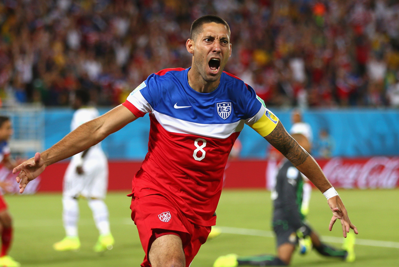
#2 Bomb-Pop

Dempsey.jpg

When you make a list like this, you always think of the critics. I have a friend I used to podcast with, this was always his favorite. Might be the only USMNT kit he owns, certainly the only one he wore around me. It’s really a solid kit. Every color on the kit pops with a super light color palate. I’m a big fan of the centralized number and the coordinated colors of the crests, blue on the chest and red on the leg, it’s smart. One of my favorite kits ever, the 2014 away kit was a winner, but not instantly loved. It took some time for USMNT fans to come around on this one, but I didn’t like Radiohead the first time I heard them, so there you go!

#1 The Centennial

Costa_Rica_US_Soccer_066cf.jpg

Every kit up to this point had been the darker, colorful, away kits, but there is something amazing about a white kit. The Centennial design was to celebrate the history of the National Team and they nailed it. Silver numbering, navy blue piping around the neck and arms, beautiful white kit. Wow. And what is easily missed, the crest is a throwback to the original USNT crest. Looks like a Captain America shield first draft and makes this American’s heart fill with pride. Can we pause for a second and enjoy this picture? Ah, the Costa Rica snow match - “Snow Classico.” I can remember the lead up to this match and the concerns about playing in the Colorado altitude, then the snow came down and it got even crazier. The Costa Rican team arguing for the match to be cancelled, Dempsey’s tap in goal, the US gutting out the win. What a time to be a USMNT fan!

Hope you enjoyed the list. While it isn’t lower tier, it’s pretty damn American.

- Dan Vaughn