The NY Cosmos: Through the Years
I’ve often used the phrase “American Soccer Royalty” to describe the NY Cosmos. Originally founded in 1970, the club played in the old NASL and was known for signing some of the biggest names in world soccer. Pele, arguably the most famous name in soccer history, is almost synonymous with the Cosmos. The club drew crowds that have only been matched by the recent ascension of Atlanta United in MLS. It made soccer cool in a way that hasn’t been seen since. And to be cool, you have to look cool. The Cosmos’ iconic kits have changed through the years, but their look has always been simple, well-designed, and fashion forward for the era.
The Original (1971 Away)
Trying to find a picture of this kit is difficult, but they do exist. With the NASL in its infancy, coverage was minimal the first couple of seasons, which makes it harder to find now. The first look seems to be inspired by an almost footballesque approach to jerseys.
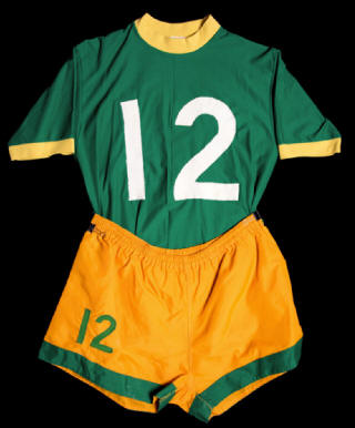
Image courtesy of NASLjerseys.com.
The shade of green is certainly near the green of the Jets jerseys of that era. The clash between the yellow piping on the sleeves and collar and the more orange color of the shorts is interesting, though I wonder if it wasn’t intentional. Hard to know at this point in time, with almost 50 years of history in the can. What we do know is that the general manager at the time, Clive Toye, chose the green and yellow because they were the colors of the Brazilian national team and Pele was already on the club’s radar. The jerseys didn’t feature names, but the players’ numbers were on the front of the kits in such bold, chest-sized, white numbers. It would have been hard to get confused about which player you were looking at. The shorts also featured a smaller version of the number in green. The home kits were the inverse in color scheme.
Adding the Name (1974 Away)
For several years, the kits became more “American” in style, adding the nickname of the club in bold vertical letters down the left side.

Image courtesy of pinterest.
The departure from the NFL style kit is certainly a welcome design change. The 1972-75 kit featured an entirely green kit, including green shorts with a yellow collar and “Cosmos” stripe down the left side. The kits continued to not feature names on the back until 1975, when they were added. It’s a classic look, one of my favorites in American soccer history. The richness of the green really makes the yellow stripe pop on this asymmetrical jersey.
Do It for Pele (1975 Home)
For those that know the name Pele, most are aware that he is Brazilian, due to his prowess in the World Cup. In a move very different from most South American stars today, he also played the vast majority of his professional career in his home country, passing on opportunities to play in Europe. Offers from behemoths like Juventus, Real Madrid and Manchester Utd, came flowing in after his stellar play in the ‘62 World Cup, but he continued to play in Brazil. His club was Santos FC, one of the premier Brazilian professional clubs. Their home kits were all white and, with his signing with the Cosmos in 1975, the club changed their look again, this time to mirror the look of his previous club, Santos.

This all-white kit, with various shades of piping, would be the home kit for the remainder of the Cosmos’ NASL run. The kit also featured player names on the back, as well the iconic Cosmos’ logo on the left chest. The logo was designed by Atlanta-based designer, Wayland Moore. The lines coming off the ball in the logo are representative of movement, which is a good thing for a soccer ball, of course. The logo has also had different variations, with the “New York” being removed and then included.
The current logo.
The Resurrection (Current)
After the old NASL died in 1984, the club competed in the MASL for a single season before closing up shop in 1985. Many years passed with the brand dormant, though several MLS clubs attempted to purchase the name. In 2010, a new ownership group purchased the club name and re-established the team. It hasn’t been smooth sailing, with multiple buy-ins from interested parties, the decision to not apply to MLS, the ups and down of NASL, and, eventually, the addition of chairman Rocco Commisso, who has grown into one of the leading voices in lower league soccer.
The Cosmos home kit is now a rich dark blue with green gradient highlights on the chest and waistline. There’s a slight white collar, which matches to the rings on the end of the sleeves. The blue is a throwback to a kit the club used in the post-Pele era. The away kit is a white top matched with green shorts.

2017 kit announcement. Image courtesy of Football Fashion.
In the American soccer landscape, clubs simply don’t have histories that go back more than 10 years or so. Most don’t go back five years. The landscape is suddenly populated by hundreds of clubs, all looking to put their spin on kit and crest design. They should take a lesson from a club with real history - be creative, be classy, use patterns and approaches that are proven. The NY Cosmos have set the bar for close to 50 years and they aren’t done yet. With the Founders Cup already on the calendar, I can’t wait to see what the Cosmos put together for the new league!
- Dan Vaughn
Just a note, there are other kits in the history of the Cosmos that were not included in this list. If you’re interested in more information, I definitely recommend NASLjerseys.com. It was a great resource in writing this article.