Top 10 Lower Tier Crests
When you slip on that jersey, the crest lays right over your heart; you give everything for that crest. Your passion for the club deserves to be matched by a strong crest design. Crest designs have always been an interest of mine as a soccer fan and artist, so I searched the web to find my top ten crests in lower league soccer. I critiqued each crest on four criteria: community link, color theory, movement and merchandising potential.

10. Virginia Beach City FC
NPSL/ WPSL
Neptune's own soccer team, branded by his very own trident. Virginia Beach, also known as “ Neptune's City,” uses the trident to link to the community. While most crests look as if the shield shape is the first design element, it is clear that VBCFC crafted this entire piece around the trident. The shape of the crest uses only straight lines that connect into very sharp corners, emulating the style of the trident.
This perfectly symmetric design, has strong imagery mixed with strong color combinations of blue/gold and black/gold that help create an image visible from a distance.
The marketability of this crest is already strong just based of the design itself, but similar to a few different clubs on the list, Virginia Beach City FC hosts two teams. Having both a men's and women's sides stylistically branded allows cities like Virginia Beach to create a soccer culture, not just a club.

9. Napa Valley 1839 Football Club
NPSL
Napa Valley is wine country if you couldn't tell. The monochromatic palette allows the crest to breathe, like a fine wine is supposed to. (I think. I'm a beer drinker.) Even the pattern on the soccer ball, everything is just tied together. 1839’s unique shape helps create a depth within the crest allowing the name to be pushed furthest up in the foreground. Its big, it's bold, and it's beautiful.
Similar to Asheville, Napa Valley's color scheme grants an opportunity to adapt the crest for particular merchandise. The light color will always play well against the dark, being legible from a distance.

8. Bearfight FC of Wilmington
USLPA
A crest and club built by passion and by the community. Bearfight uses the flag of Wilmington to immediately tie the club into the community. The ferocious bear counter-balanced by the sailing ship ( this ship is also located within the city’s flag and seal) keeps this asymmetric piece active.
The blue and yellow tones, taken directly from the city’s flag, offer not only a community link, but a strong color scheme that helps make this design stand out. The two tones of blue seamlessly transition into one another, blending into one image. The bright yellow border helps keep this flowing design from escaping the page.

7. Himmarshee Soccer Club
Gold Coast SPL
HSC caught my eye while I was researching for my article about community-owned clubs.
(https://riversidecorasblog.wordpress.com/2018/06/06/communityowned) Instantly I fell in love with the minimalist design. It let me know exactly who Himmarshee was, and what it was about.
The crest's most unique characteristic is the Himmarshee river, acting as the seam of the soccer ball. With the use of concentric circles, everything is revolving around soccer and the community while the cardinal and gold color contrast helps the design pop with very few elements.
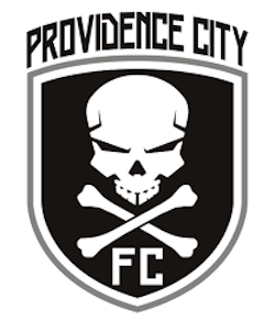
6. Providence City FC/ Rhode Island Rogues
BSSL/ WPSL
It's easy to say that while there aren't too many elements within this piece, it is by far the most BADASS crest in all of lower league soccer. The Rogues have used a symbol that has struck fear in enemies for centuries. This adapted Jolly Roger, accompanied by a sharp font and the traditional gray-scale, helps strike fear into their opponents.
The Rogues field both a men's and a women's side. By fielding both sides, Providence has the opportunity to help develop a soccer culture within its community. A culture that waves its Jolly Roger proudly.
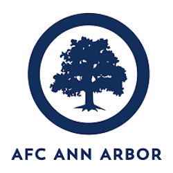
5. AFC Ann Arbor
NPSL
Keep it simple, stupid. We are taught to KISS at an early age; it keeps your message clear and concise. For AFC Ann Arbor, there’s nothing more iconic than a tree (arbor in Latin). The strong symmetrical tree planted within the round border creates an impactful image that is noticeable from a distance. The deep blue color helps strengthen the simple yet iconic imagery.
The Arbor's true potential lies in it's marketability. I’m talking graphics, merchandise, flags and tifo; these are the things the team capitalizes on. AFCAA has some of the best soccer merchandise on the market, each unique design still focuses on the Ann Arbor community. It’s one color, one tree, for one club.

4. Asheville City Soccer Club
NPSL/ WPSL
The focal point, Asheville City Hall, is the perfect contrast, from it's Art Deco-esque design to the movement of the city’s initials. The negative space underneath the focal point offers stability throughout a very active design.
Every element tries to reflect the community that it supports, even down to the color, described by ACSC as “ Blue Haze, named after the haze that early settlers identified with the Blue Ridge mountains.”
Due to the crest's sticker-like qualities, it makes for a perfect merchandising tool. The color choice of the “Blue Haze” against the white offers many options for adapting the logo to specific merchandise.
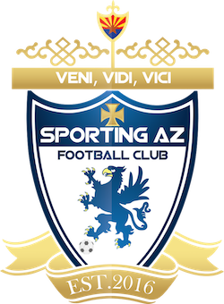
3. Sporting AZ FC
UPSL
The king's crest; and no I'm not crowning Sporting AZ FC as the best crest in the lower leagues, but rather speaking of the design itself. The gold banners and knot work help create a crest fit for soccer royalty. In between the intricate knot work lies the Arizona state flag, that helps cap off the top of the crest. “Veni, Vidi, Vici” translated to “I came, I saw, I conquered;” a perfect descriptor of a club who within two years of joining the UPSL, won the Southwest Conference and made it all the way to the 2018 NPSL Spring Final.
The great mythical gryphon- used throughout lore to depict the king of beasts -is placed as the main image of the crest. The gryphon brings strength to each player and a strong focal point for this design. Complete with the complementary color palette, this crest remains a strong symbolic image for the Arizona soccer fan.

2. Erie Commodores FC
NPSL
In the center of this gorgeous crest sails the USS Niagara, a ship used to defend the shores of Lake Erie, in the War of 1812. The use of the moniker Commodores, relates to the American style of sports branding, while still incorporating the traditional soccer label FC.
The crest uses complimentary colors, helping the ship pop off the badge. As your eyes move towards the back of the ship you notice the flag, and then the crest begins to tell it's story.
“Don't give up the ship” is a slogan with passion and fight. Just looking at this crest I can picture the awesome shirts, hats and tifo; just so much potential. Small additions like a slogan help drive a statement with fans; show them who you are and what you're about.

1. Athletic Club of Sloan's Lake
When creating a crest, one should take a city’s flag into consideration during the design process. The city flag often ties in history, as well as offers a color palette for your club that already represents your city. For ACSL, it was the small manipulations to the flag of Denver that created a unique piece for Sloan's Lake.
My favorite element within the crest is the waves. Immediately your eyes read the name of the club, then the waves pull you to the bottom of the crest, only to push your eyes back up to witness the Colorado sun peaking over the mountain. One change from the Denver flag is the loss of white, which was replaced by light blue accents. This small adjustment helps keep every element focused on the community.
New clubs and new crests appear every day. As the American soccer culture begins to further develop, we will continue to see strong crest designs that will help financially support lower league clubs.
Did I miss a few clubs, or you want to explain why your club's crest is the best? Find me on Twitter @StevilFC.
- Steven Ramirez