Top UPSL Crests
A crest defines a club. It’s the first thing someone thinks of when they hear the club’s name and serves as a form of identification for the club, but, as any fan of soccer can tell you, not all crests are created equal. Throughout the UPSL, there are great crests that represent not just the club, but also the community that the team represents. These ten rise above the rest.

10. Visalia Golden Bears
Visalia, who play in the Western Conference - Wild West Division, have a logo that is fairly simple. In the center is a bear, the team's mascot. To the bear’s left and right are two trees, representing the rich wildlife and forestry in the area. The background features a mountain range, likely the Venice Hills that you can see in the distance from the city. The logo is overall very appealing to the eyes and does a good job of showing the wildlife in the area.

9. Colorado Springs FC
Colorado Springs FC of the Colorado Conference (UPSL Pro Premier) have a very basic, but effective, logo. It is set in the shape of two concurrent circles with the outer ring being blue and featuring the name of the club. The inner circle is red and features the signature mountains that are so often associated with Colorado. It is simple, easy on the eyes, and shows influences from their hometown.

8. Newport FC
Yet another team from the state of California, SoCal division’s Newport FC sport a wonderful logo. The color scheme and overall design is similar to that of Manchester City, yet different enough to be their own. In the center of the logo are three sailboats, a nod to Newport Beach’s sailing culture. In the background are four quadrants of light blue water designs, adding to the overall aesthetic of the crest. The light blue and gold looks great together and works great in this application.

7. Miami Dade FC
For our seventh spot on the list, we hop to the opposite coast and look at the crest for the Southeast Conference (Florida South Division) Miami Dade FC. It features a combo of blue and yellow and is reminiscent of a hurricane warning sign. The main part of the crest features a palm tree next to waves in the Atlantic Ocean. The tree is being blown by hurricane winds, representing the fact that Miami goes through hurricane season every year. It conveys the idea of toughness and power without being over the top

6. Lowcountry United FC
The club from the Southeast Conference Mid-Atlantic Division has one of the most symbolic crests in the UPSL. It represents their city and their culture in an amazing way. The main focus point of the crest is the Ravenel Bridge, which connects two of the towns in the Lowcountry, Charleston and Mount Pleasant. It is also symbolic of the club’s dedication to bridging the gap between the area’s collegiate/recreational teams and its USL club in Charleston. The two arches on the bridge “signify the passion for both club and community.” The moon is part of the South Carolina state flag and the water represents the beaches that the area is known for. The color scheme of orange and black represents the sunsets and sunrises on the area beaches and the gold ring around the edge represents the goal to bring unity through soccer. Overall, the crest has so many different points of symbolism that it would’ve been hard to not include it in this list.

5. Jupiter United SC
Jupiter United FC are located in Palm Beach County, FL. The crest is a very classic looking shield with the word “Jupiter” on top and “United SC” on a ribbon across the lower part of the logo. The shield itself is split vertically with the left side being green and the right being blue. Sitting in the center is a lighthouse, specifically the Jupiter Inlet Lighthouse, which is located in the club’s home city. It’s a pretty basic logo, but basic in a good way, as it does not do too much, while still looking very nice.
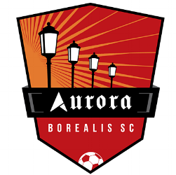
4. Aurora Borealis SC
Located in Aurora, Illinois, Aurora Borealis SC has a crest that shows of the city’s heritage better than almost any other club. Back in 1908, the city adopted the nickname, “The City of Lights,” as it was one of the first American cities to move to an all electrical system of street lights. The crest for the club shows four lamp posts in a row and illuminating the night sky.

3. Sporting Orlando
The image is complex on first glance, but more simple the more you look at it. The main focus of the logo is the name of the club, Sporting Orlando Soccer Club, in large letters across the middle. Near the bottom is a circle made up of one half of a soccer ball and half of an orange. It’s symbolic of the state’s citrus industry and provides a simple, but effective crest. The blue and orange color scheme makes it pop even more as being distinctly Floridian.

2. Dekalb County FC
Dekalb County, Illinois is a rural town with a big division one college. The club uses Northern Illinois’ soccer field as their home stadium. The logo was designed by a local artist, who used the image of corn to show both the area’s roots and how the cub started as it “grew out of the stalks.” The green and yellow color scheme just hammer the corn idea further home, but the soccer ball as the cob of corn is eye-catching and sets this crest apart from most others.
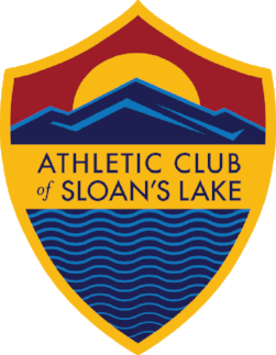
1. Athletic Club of Sloan’s Lake
My top crest in the UPSL is that of the Athletic Club of Sloan’s Lake. On the bottom is a “modern take on traditional heraldic” representation of water, which obviously symbolizes the lake that the team is named after. On top is the sun setting over the mountains, a common thing to see in the area. It is also reminiscent of the Colorado state flag. The shadow on the mountain forms the letters “SL” for Sloan’s Lake. The color scheme shows the history of the Spanish founding of the city and the vast hispanic population, as well as being a nod to FC Barcelona and their style of play. The entire shape of the crest has significance as Roma’s crest was used to show the influence on the area.
- Aarik Long