Top 10 NPSL Crests
So before I piss anyone off- which will happen, I promise -allow me to congratulate the NPSL on a solid bunch of crests. While the UPSL has some great ones, there are a couple here and there that could use some help. The NPSL, with fewer clubs and more stability, has their crest game down. So congrats! One other piece of business before I start my countdown: two crests will not be on my list even though they were close. The Kitsap Pumas, RIP, had one of my favorite crests ever. I’m sad to see them go. Another club, NY Cosmos B, was left off the list because their crest is a classic, but not an NPSL classic. The Cosmos crest is royalty and I’ll die defending that club, but their participation in the NPSL doesn’t make that beautifully designed ball and swirl belong to the league. So that business is out of the way, let’s piss off a bunch of teams!

10. Napa Valley 1839
Almost eliminated because it’s a tiny bit cheesy, I couldn’t resist making this number 10 on my list. Accusing it of being cheesy isn’t fair, instead I should say it is unique and appropriate for its location. First off, great color combination; not too unlike a club further up the west coast. The bottle is the perfect symbol for the area and might be the only one of its type in the sport. Napa County has over 400 wineries so using a wine bottle in the logo connects the club with its local population. I’d argue that the connection to the location is a theme that will crop up over and over again in this list. Without a doubt a unique crest.

9. Greenville
As many of these crests seek to do, Greenville FC’s uses specific imagery to tie itself to the town it calls home. For Greenville, using The Liberty Bridge as its central image was the obvious choice. The Liberty Bridge was opened in 2004 as a pedestrian bridge to improve access to park space and allow for viewing of the beautiful waterfalls that lie below. It’s a unique piece of architecture that anyone from the area will recognize and connect to. Across the top of the crest is “GVL” to indicate the club and city. The letters are centered between two pillars of the bridge, which allows the eyes to follow the flow of the crest down. Included below the bridge is the shape of the South Carolina with a stacked block of “FC” over “18” to recognize the year the club was founded. It’s a beautiful piece of work and a great example of a badge.
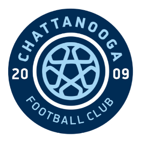
8. Chattanooga
One of the massive success stories of the lower tier, Chattanooga draws impressive crowds from its region. Likewise, its crest is drawn from several regional inspirations. The focus of the logo is a sky blue ball, inspired by the city flag which centrally featured a large star (it has since been changed). Notice the subtle star in the ball’s layout. The colors of the crest and club were regionally influenced as well, drawn from a local university’s palette, though subtly modified with the addition of the sky blue color. The crest also featured the founding year, 2009, and the name of the club. The logo has remained largely unmodified since constructed, as the elements are simple and refined.

7. PDX
The shape of this crest, and the bird that sits on it, is eye-catching. Inspired by the Great Seal of Oregon, the shield-shaped crest features large, bold letters spelling out the club name, PDX. The font of the letters is inspired by the Schnitzer Concert Hall’s facade, a downtown theatre since 1928. The bird is actually a Western Meadowlark, the state bird of Oregon. The badge was the product of a rebrand, only a year into the club’s existence. Every element hearkens back to its location and place, allowing fans of the team to see the connections to their everyday lives in the city.

6. Little Rock Rangers
I cannot lie, I do love a nice round crest. While the shield shape is fun and seems to be a trend, round crests have a nice enclosed shape that demand balance. The Little Rock Rangers’ crest is a lesson on how to include local elements to create a unique piece of soccer lore. The top section of the interior of the logo features two deer and three pine trees, both state representatives within their class. Below on one side is the number “16,” indicating the 16 founding families of the club. The other side has the shape of Arkansas with a star showing the location of Little Rock. Circling these images is the name of the club and two soccer balls (my only complaint against this crest). If you see that crest, you know a bit about the state, the city, and the club. Simply put, all you can ask from a badge.

5. MPLS City
Unlike so many clubs that seem to emerge into a league with a ready-made kit, MPLS City allowed its lore and backstory to develop naturally. Several identities vied for the top spot in the beginning, but the Crow emerged from the crowd as the favorite. Viking Bar, which was near the second season’s home field for the club, was the pre and post game drinking spot and the area around the bar was the roosting spot for a massive murder of crows. For MPLS City, bringing this iconic bird onto the crest only made sense, it was an integral part of their origin. Even the letters that wrap around the crow are inspired by a Minneapolis icon. The font was designed to match the lettering on the facade of the Foshay Tower, which has stood downtown since 1929.

4. Kingston Stockade
When Dennis Crowley and his team were putting together a club in Kingston, NY, the inspiration for the name had been in the ground for 300 years. Originally a Dutch settlement, the Stockade District of Kingston, still shows the raised ground where the European settlers had built a fort. The District is now a bustling 8 block area, full of historic buildings and city landmarks. The Stockade crest is clean and simple, reflecting a modern design approach. The image could easily be an app icon on your phone. The spiky row of lines across the entire crest are a call back to the original stockade the Europeans used to protect themselves, while the name of the club, in all capitals, is white on a black bar. It’s as if the club is being selected and highlighted on a computer. One of my all-time favorite crests, due to its simplicity and attention to design.
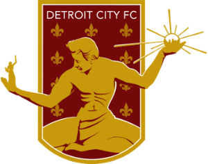
3. Detroit City FC
Maybe the most famous lower tier club in the country right now, Detroit City FC has earned a reputation because of its play on the field, a raucous bunch of supporters in the Northern Guard, and a beautiful crest and color scheme. The crest is dominated by an iconic statue in downtown Detroit, The Spirit of Detroit. Behind the image of the stature, a maroon background is covered with a pattern of fleur de lis, inspired by the original French settlers who founded the city. Behind the statue in Detroit, there is a wall with an inscription which reads “ Now the Lord is that spirit and where the spirit of the Lord is, there is liberty. II Corinthians 3:17.” For a club that inspires one of the most enthusiastic and iconic fan bases in the country, choosing this image has created a perfect pairing.
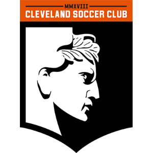
2. Cleveland SC
This one was just barely edged out by the number one club, but there’s nothing to criticize at all about Cleveland’s crest. It was designed in a club collaboration with CLE Clothing Co. The stoic face on the logo is from a local landmark. The Hope Memorial Bridge is a city icon and features four prominent statues named “The Guardians of Transportation.” The massive statues depict four different guardians, each holding a type of transportation. During the design period, the owners of CLE Clothing Co., Mike and Laura Kubinski, were convinced that the guardian imagery be included in the crest. The club agreed and a beautiful badge was born. The black and white divide, shaped by the face’s profile, is sharp and eye catching. The brown bar that extends crossways across the crest hearkens to another famous Cleveland club, the Browns.

1. AFC Ann Arbor
I am a fan of simplicity and clean design. AFC Ann Arbor’s crest is absolutely stunning. The Mighty Oak stands alone in a white field, contained by a blue circle. Every time I see it, I am inspired by it’s simple design that checks all the boxes. It’s connected to the club and its location. There’s no goofy soccer balls to mar the image. It’s a perfect crest. The best in the NPSL.
- Dan Vaughn