Top

Protagonist Soccer

Lower Tier Soccer | Top Tier Coverage

Protagonist soccer is a media organization dedicated to lower-tier soccer; UPSL, NPSL, BSSL

  • Home
  • About
    • About Us
    • Staff Directory
    • Join Us
    • Patreon
    • The Weekly Wrap
  • Shop
miami 1.jpg

Miami United FC: A Piece of Art

September 07, 2018 by Lola Vaughn

Sport has been closely intertwined with American culture for a long time. Baseball is considered America's pastime and the NFL is so popular, that asking for one's favorite team is considered a normal greeting. What about the young and developing hip-hop culture of the 90's that embraced the NBA through style? Soccer is on that trend in America: viewership numbers are increasing, soccer has become more accessible in the US than anywhere, and the soccer jersey is becoming an iconic fashion statement.

Even with the remarkable success of the Nigerian World Cup 2018 kit- sold out with three million pre-orders -most clubs are unwilling to take the risk in creating something unique. The Columbus Crew of 2016 reverted back to the old yellow jersey after the failure of its new City of Columbus inspired kit.  

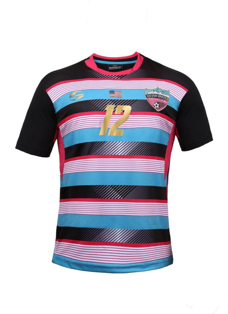
While popular MLS and global teams continue to create dull and standard jerseys, clubs in the lower leagues have begun to create pieces of art. These clubs embrace creativity and reflect their communities. Miami United FC of the NPSL Sunshine Conference are one of the trendsetters in the South. For this week's Uni-formity, I will look at the MUFC 2017 home kit. This beautiful, sleek and luxurious kit is a working piece of art. The variety of details come together in a perfect blend of chaos, making this kit one of the coolest in soccer.

Pickin' The Palette

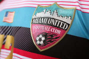
“We picked the colors that represent Miami: it's magenta and aqua. The club was born in 2012 and we used those colors, the art deco colors of Miami Beach, because no team used these kinds of colors in the world. We wanted to keep this unique, that's why we came up with the color and this new kind of design.”

- Roberto Sacca, founder and CEO of Miami United FC

The most important step to creating a jersey, or an  image for your club, is finding the correct color scheme. Each color must represent the club and the community, all the while serving its function on the field. Miami United FC has stepped out and chosen an iconic color palette that has been associated with Miami for decades. Teal and pink- popularized by hit 80s television drama Miami Vice -became widely associated with the world's view of the city: it's bright, bold, and expressive.

Bob Ross said, “You need the dark in order to show the light,” and perhaps he wasn't just talking about art; it is a rule of color that this kit’s designer was well aware of. The black puts a tight border around the colorful foreground, then fades perfectly into the background allowing each color to pop.

I Like GOOOOOOLD!

What is more luxurious than gold? Nothing! Each gold number and every piece of gold trim just helps create that perfect image of luxury without taking away from any of the other elements.

Hoop Dreams

Hoops have been a traditional design throughout soccer's long history. Most hoops are bold and continue to cascade to the bottom of the jersey. Miami goes with five different hoop variations: bold teal, medium pink, bold white with thin pink hoops inside, and transparent hoops that show the black background.

miami 5.jpg
miami3.jpg
miami4.jpg

“United”

What does it mean to be united? The use of “United” has become so common within soccer culture that you almost forget the meaning. A soccer club has the power to unite multiple communities for one cause, but how do you design that on a jersey?

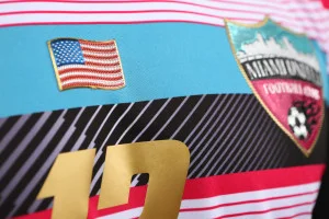
This Miami United FC kit is packed with elements: five colors, hoops of varying sizes, hatching, cross-hatching, a flag, some numbers and two logos. With so many elements within one piece it's easy to lose or even find any message, but that is the brilliance of the kit. The message is that chaos, all of those varying design elements, they all come together for one purpose: representing Miami United FC.

My Favorite Element

Every time I look at an art piece, I get fixated on one element; even though I try to view the whole piece, I always come back to that one element, the black background. The black background helps everything thrive and stand  out as its own element. From a distance, the hatching in the middle of the kit creates a gradient of black that gets strongest towards the back of the jersey. Once you get in close you get to see the variable line weights, blocked out patterns, and the subtle cross-hatching below the collar.

In the lower leagues, where financial support is scarce, a unique kit design can help a struggling club stay afloat. As our soccer culture continues to grow and evolve, clubs will need to strategize on how to cultivate their images, populate their clubs, and perform on the field. A fresh kit can help solve all those problems. This Miami kit rings up at $69.99, a premium price for premium style. On top of the style and quality of the jersey, extra points to Miami United FC for producing jerseys in XL for us beer-drinking, dad-bod having soccer fans! So,whether you rock this jersey out on the town or at a soccer match, you are guaranteed to turn heads and start conversations.

- Steven Ramirez

September 07, 2018 /Lola Vaughn
Image courtesy of Steffenhagen Photography

Image courtesy of Steffenhagen Photography

A Matter of Murder Sleeve and Keeping Kits interesting

September 01, 2018 by Lola Vaughn

Social media has provided a revolution in the American lower tier soccer community, but not just when it comes to chronicling results and exchanging banter. It has also proved a barometer for moments of genius in branding, badges, and kits. There is perhaps no better example of this phenomenon than NPSL North side Minneapolis City SC’s 2018 kits. From the smoother primary kit, a clean white jersey with a striking black depiction of the Sabo Bridge across its chest, or the away kit, a bold pink and black flannel pattern (nicknamed the “modern Paul Bunyan”), Minneapolis City’s kits made their way across the Twitterverse about as fast as a kit can.

Minneapolis City, as is becoming more and more common in the growing lower league community in the US, has always been about celebrating a unique identity. Whether that be about Minneapolis and its history or celebrating American and Minnesotan soccer, Minneapolis City’s identity has been as key to the club’s growth as its positive results on the pitch. With that in mind, I talked with club co-founder Dan Hoedeman to see how his club’s identity and recent partnership with Stimulus reflect the club’s priorities and goals.

When asked about the club’s decision to pursue a more customized path with their kits, Hoedeman put it quite simply. “We went with custom kits because we have to be us. There is no way that we would have been able to make something work within a template, that's just not who we are.” It wasn’t, however, just about being different. For Minneapolis City to grab people’s attention and earn their support, it needed its unique take to be appealing. “They looked good. There is an interest in key design. These looked like nothing else that other clubs were putting out, especially the templated clubs/templated leagues.”

In a soccer environment where the top tier is often criticized for a lack of diversity when it comes to kit designs — including the revelation this year in which all MLS teams share the same goalkeeper kit — the presence of a design and color combination that no one has seen in the game before has all the more meaning. The independent nature of lower league kits like Minneapolis’ also allowed local artists and designers to have hands on interaction in the creative process. “We have a really strong design community in Minneapolis and those designers know their stuff. It's no surprise that when they're given the freedom to go design cool stuff that we get cutting edge stuff. Sure, it's within our brand, but our brand is really elastic. It just has to feel Minneapolitan.”

original-1.jpeg
original-2.jpeg
original-3.jpeg
original.jpeg

Having discussed the process, Hoedeman moved on to explain the meanings behind each kit. In regards to the home strip, Hoedeman says it “Harkens back to the club's first season at The Barnyard [Les Barnard Field] basically under the shadow of the bridge, has a connection to our new Intergalactic World Headquarters, and is super close to Edor Nelson Field”. Edor Nelson is Minneapolis City’s home pitch and part of the Augsburg University campus.

On the particularly famous away kit, Hoedeman explains it was the obvious choice not just because it was the look they wanted, but also because it provided a message to many stereotypes about Minneapolis. “We ended with an away shirt that put the MPLS City twist on the Paul Bunyan look and worked for the people outside of the metro who called us hipsters for it. A very authentic Minneapolitan experience.”

Finally came the goalkeeper kit, which featured a relatively straight forward body but also a unique sleeve design, “We ended with a GK shirt that references the south Minneapolis "mega murder" which maybe a lot of people don't/didn't know about, but for everyone from town and everyone who did post-games with us at the Viking Bar they know the Mega Murder well.” The “mega murder” inside joke is rooted in a strange phenomenon in which thousands of crows — which are the club’s mascot — appear across the metro area. With “murder” being one of a few words used to refer to a large group of crows, the phrase “mega murder” gained traction as a comedic but accurate description of the surprising carrion presence in Minneapolis and the surrounding metro.

The element yet to be featured in this article is that of the kits’ producers, Stimulus Athletic. “The story of Geison Moura, the founder of Stimulus, is a great one too. A playing career takes him from Brazil around the world with a stop at Minnesota United that resulted him putting down roots in Minneapolis. We saw a lot of our business in his. We were pumped to be able to help him get Stimulus really going and move into his post-playing career… We got to support an awesome local business without making any concessions on quality. We feel very lucky to have Stimulus as our kit partner.” Stimulus, founded by Moura after his playing career had ended, has made big moves in intertwining themselves into lower league soccer and now make kits for numerous clubs at various levels of the game, from the local Minnesota Amateur Soccer League (MASL) to NPSL clubs like Minneapolis City.

As the stories and explanations above will likely show, each of these kits are visibly and emotionally connected to the city they call home, an important narrative sewn throughout the lower league kit community. Hoedeman feels that beyond the likes or dislikes of a design, this was what made it all matter. “The designs were perfect because they looked great and also had this deeper narrative, this triggering of these great experiences and club history woven into them." In an ever growing community of unique looks and brands, one that has found its home in lower league soccer far away from corporate deals that otherwise limit design, Minneapolis City stands out as an example of how creativity could provide us with countless soccer clubs that challenge the usual limits of design in sports.

- Dominic Jose Bisogno

September 01, 2018 /Lola Vaughn
  • Newer
  • Older
 

Protagonist Soccer LLC © 2023